How to create an affinity map for research
Affinity maps—sometimes called affinity diagrams—are extremely helpful for any team that has to analyze a lot of research data. But they’re vital for an organization where several cross-functional teams have to look at research findings together.
At Think Company, we use affinity maps to synthesize our research findings so that anyone on any team can easily see and understand what we’ve uncovered. Then we can all work together to talk about what those findings mean and plan our way forward.
What is an affinity map?
An affinity map is a visual synthesis tool. You can take large amounts of data gleaned from research and visually organize that information into groups of themes based on commonalities. For example, they can be used when discussing an improvement to the user experience on your website. Everyone places their improvement ideas on the board and then similar ideas are grouped together. Think “better chatbot experience,” “Add a live chat feature,” and “create channels for customer service.”
What are affinity maps used for?
Affinity maps are used to help you quickly and powerfully surface common themes in research findings, and present those themes in a way that almost anyone can interpret. Affinity maps also frequently inform field notes for client updates, streamlining processes and making it easy to communicate what you’ve found so you can decide where to go next.
How to use an affinity map for UX design research
Affinity maps are helpful for many different types of research and analysis—from thematic analysis to assessing qualitative data. But you wouldn’t use it for quantitative research or something like a focus group. (Focus groups tend to have multiple perspectives at one time which allows for thematic conversations to happen at once, which eliminates the need for affinity maps.)
Affinity maps are particularly useful for research with lots of context and taking various experiences into account. Think of research where you’re asking open-ended questions—like in-depth interviews (IDIs). Affinity maps are perfect when you need to synthesize that kind of data. They can also be useful for synthesizing information after an ideation session or workshop.
What should be included in an affinity map?
How to create an affinity diagram
Once you have the data you want to analyze, how do you start creating an affinity map? There are five key steps:
1. Generate ideas
Start by generating the ideas you want to gather your findings around. These ideas will help shape your questions and notes.
2. Create notes
Move the process forward by creating notes from your research. This can also be from a team brainstorming session.
3. Look for patterns and themes
Once you have your notes and feedback, put all this information into a spreadsheet or other visual information tool (we often use Miro or FigJam). This will help you see everything at once and move to the next step.
4. Create and name groups for patterns
Now you can start grouping similar answers and ideas, and begin establishing themes in your findings. Name these groupings by their key identifying factors, but remember that you may need to make slight adjustments as you go.
5. Explore findings from groups
Once all of your data is organized into groups, you can explore your findings and see how each group relates to the others—or doesn’t. You can visualize these connections with grouping, arrows, or other indicators to suggest relationships between themes.
An affinity map example
Let’s get to the good stuff. What does an affinity diagram look like? Here are a few examples:
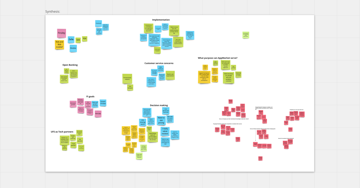
Synthesis
Here you can see an affinity map from an initial synthesis, where information is clustered around emerging themes and additional questions.
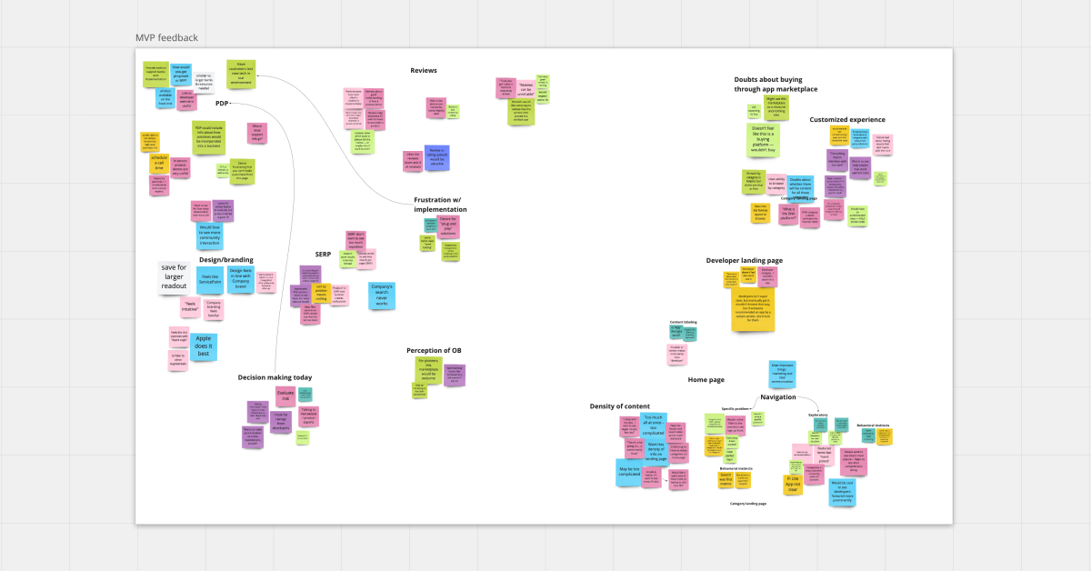
MVP Feedback
After the initial synthesis, you’ll see affinity maps that look like this. MVP feedback pulls out findings specifically related to the product you’re evaluating.
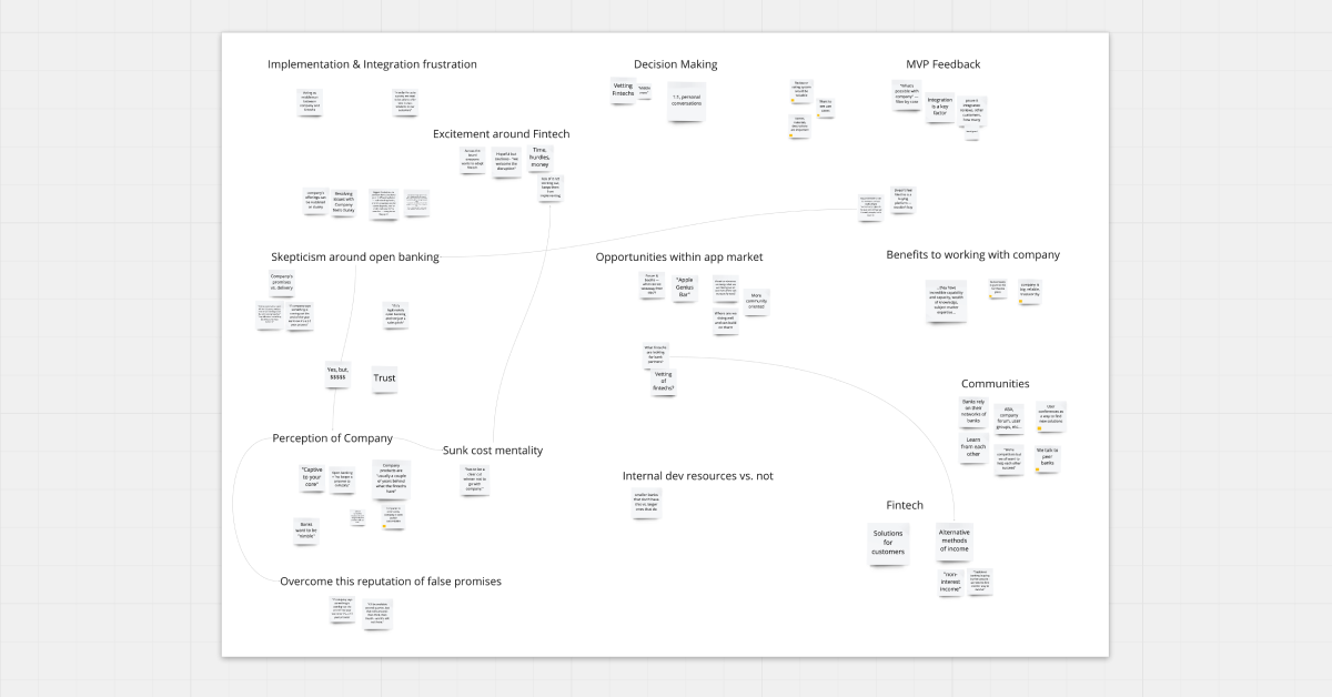
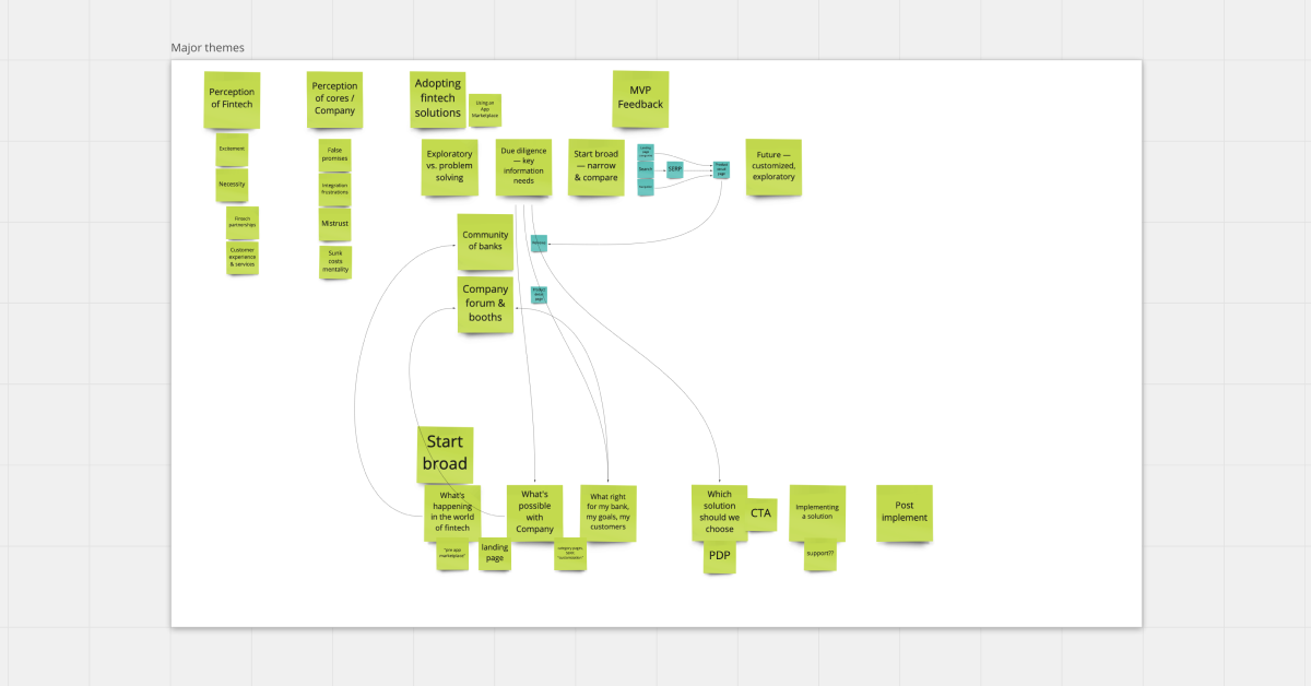
Major themes
This affinity map example builds on the others, summarizing all findings at a high level and making connections between them.
Affinity Mapping for Enhanced Data Analysis
Here at Think, we heavily focus on research—as a user experience company, our biggest goal is to improve user experience by modernizing digital tools and solutions. We need to understand the user’s actions and pain points to do so. That often means we uncover a lot of data in our research phase. Affinity maps or affinity diagrams are an excellent tool for helping teams analyze a lot of qualitative data. By synthesizing research findings with an affinity map, multiple teams across disciplines can access, analyze, and discuss what the research is saying—and plot a meaningful path forward.
A special shoutout to Kathryn Robbins for her contributions to this blog post and for the creation of our FigJam template.