Design and Technology Guides
A guide to dashboard design
You’re probably already familiar with dashboards. Every time you refresh your favorite news site’s homepage, check Google Analytics, or look to see how much gas is left in your car’s tank, you’re interacting with a dashboard (very literally in the last example).
An excellent digital dashboard is a visual representation of your user’s most valuable data—and makes it easy for the user to ingest and take action on this information.
Digital dashboards were invented to mimic the function and helpfulness of their physical predecessors in a digital environment. And many of the same things that make a physical dashboard helpful and successful inform the usefulness of a digital one.
Digital dashboards ultimately draw the user deeper into the site or app and offer a preview of their experience. A well-designed dashboard supports your business objectives by quickly and efficiently providing your user with the information they need to take action.
What is a dashboard?
At its most basic, a dashboard is a screen that displays information your user might (should!) find helpful before they engage with other parts of your site or app. This screen usually offers a high-level overview of data and functions they engage with, and provides access to the most helpful information they’ll need to succeed.
What makes a good dashboard?
A good dashboard is more than just an assembly of graphic elements. It’s your user’s first interaction with you each time they log on and their launch point for the rest of your services. The best dashboard design conveys your user’s most important information as quickly and efficiently as possible.
It’s essential to note that it’s crucial not to overload your dashboard. You want your user to have enough data to be informed, but not be so overloaded that they are paralyzed and don’t take the action(s) you’re trying to drive.
The role of UX in dashboard design
Customer research is central to creating a successful dashboard. Nothing is more detrimental to a dashboard experience than showing the customer something they don’t value or need—or something they don’t understand. Conducting user research and understanding your dashboard UX is critical to creating a dashboard that is useful and engaging and draws users to perform the actions you want them to take.
We recommend that designers conduct in-depth interviews (IDIs) with users and stakeholders to decide about essential info or tasks. Our team usually asks questions like:
- Does a user need to complete tasks at the start of their day? What are those tasks, and how would you rank the importance of each one? Is there a sequence that the user typically follows?
- Are the users experts in a particular field and can ingest precise data? Or is the user group broader, needing easily consumable data that leads to more detailed information accessed through additional actions?
- Are users more right or left-brained? Will words resonate with them, or are they more motivated by numbers and images? Is your data more consumable in an infographic or a paragraph of text?
- What kind of device might users be consuming information from? On the fly from their phones? Sitting at a desktop workstation as part of their job?
In addition to IDIs, designers should also consider accessibility and inclusion standards. Could part of your user base be color-blind? (We can answer this one for you: yes. 8% of men and 0.5% of women are colorblind.) Does your design consider people for whom English is not their native language and who might have difficulty reading large blocks of text in English?
A comparative and competitive analysis can be a great tool even if you can’t perform user research. Or you can audit an application or a site to find components that are working, and use these findings to inform possibilities for your current design.
Types of dashboards
There are many different types of dashboards, and each dashboard layout design serves a specific purpose. The key is to choose the kind of digital dashboards that suits your particular user and product best.
Analytics Dashboard
Analytical dashboards offer a high-level view of the data your user needs for analysis and making decisions. This data is usually less time-sensitive and is geared toward helping your user understand vast swaths of data, and is shared to invite the user into a deeper understanding of the information.
Strategic Dashboard
Strategic dashboards emphasize the data about performance against a set of key performance indicators (KPIs). All of the information featured is directly related to how the user is performing in the context of their goals.
Operational Dashboard
Operational dashboards are the most immediately functional style of digital dashboards. This type of dashboard is geared toward users who have a time-sensitive task to complete and offers information about current resources and status updates. An operational dashboard is a kind of “control panel” that empowers users to take quick action and be efficient.
Key design components of a well designed dashboard
While dashboards vary based on goals, all dashboards include various charts, metrics, and interactive elements that visually display data and information at a glance. They’ll often be displayed on cards that help separate data and keep things organized. When designing a dashboard, it’s important to think about personalization. Many dashboards allow users to move cards around their dashboard to align with their needs and priorities.
A few key components for dashboard design include:
- They allow the user to access quick, easily digestible information
- They’re succinct and provide detailed information in a limited space
- They display information clearly (like the cards we mentioned above)
- Data visuals help show trends and changes in the data over time
- They allow the user to easily personalize the information that is most relevant to them (as we mentioned above)
It’s important to note that the key components of a dashboard’s design vary depending on the type of dashboard you’re building. An analytical dashboard may have more glanceable charts. A strategic dashboard could show big numbers and trends of those numbers. An operational dashboard might have the most minimal infographics of all three because of the time sensitivity. Selecting components and their hierarchy always comes back to research findings or understanding the tasks a user needs to complete.
Best practices for designing dashboards
There are many considerations when designing dashboards that are user-friendly, accessible, digestible—and get the job done. Below are a few dashboard design best practices to keep in mind.
Modular design allows flexibility for user’s goals
Modular design is dynamic design. Creating modules you can add, reconfigure, edit, and subtract over time means that your dashboard stays relevant to your users’ adapting needs.
Ensure charts are glanceable and easily digestible
Charts are a major part of any dashboard design. They should be easy to glance at and understand. No squinting. You want to provide data that’s easily digestible. Use a clear, legible font that is sized appropriately.
Use size to denote the hierarchy of important information
Use size to denote hierarchy. Big content draws the eye and can help you guide your users to what they need first. For example, big numbers are good. They help draw your user’s eye directly to the metric.
Use a consistent and accessible color scheme
Coordinating colors with trends uses your user’s physiological response to color to reinforce the data. Using color too liberally can dilute this effect. However, ensuring colors aren’t too close in scheme is important. Make sure colors in charts and graphs are accessible to color blindness.
Dashboard design examples
It’s impossible to understate the importance of the visual elements designing your dashboard. Large numbers, precise data, and negative space all work together to convey critical information and help your user perform the task they’re there to do.
Google Firebase
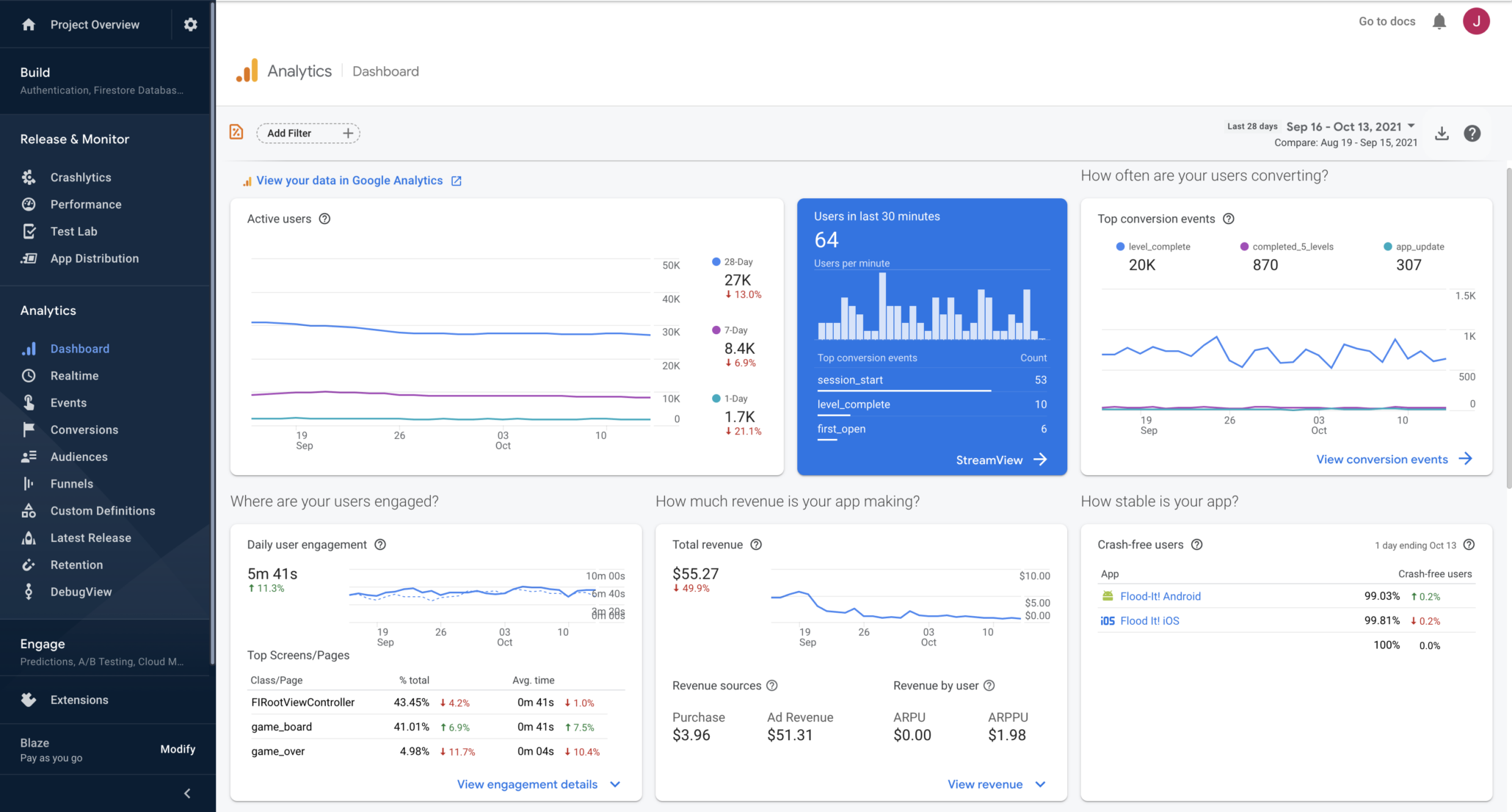
Why we love it:
First off, this dashboard’s layout is very responsive and design-friendly. The cards can be reorganized without drastically changing the structure of what the user is seeing. The natural language is welcoming, and the questions featured directly impact the corresponding card below. Instead of the user guessing the importance of the card itself, the question frames its importance.
Large numbers make it easy to see and comprehend the data, and the graphs are concise, making it easy to view trends. When a user hovers over a chart, simple data points appear so that a user can quickly summarize what they’re seeing.
Trends are shown with both color and icons, ensuring greater accessibility. Links to more details in the cards lead the user to more in-depth data if they need it.
Apple Health
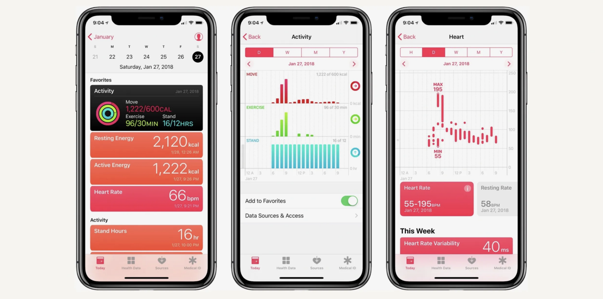
Why we love it:
The large numbers are easy to read and make it simple for the user to understand essential data quickly. Apple also uses color to string together a story on how components relate to one another. Energy topics are orange, exercise minutes are green and correspond to the green slice of the pie chart, etc.
These charts are very streamlined (not many labels or text) but allow users to discover more when they hover over the graphic. The use of filters also helps Apple separate the data they show users. Each day has its own dashboard broken down by the dates at the top, allowing the user to drill down into data for that day. Then those cards enable the user to explore even more data if they click.
Dashboard design enhances data visualization
A well-designed dashboard supports your business objectives by quickly and efficiently providing your user with the information they need to take action. If all content should ultimately drive some kind of conversion, utilizing a dashboard to present actionable data can be the most obvious execution of content in your organization.
Along those lines, involving a good Content Strategist in the dashboard-building process is often the “secret sauce” to success. Even for more analytics-driven dashboards, a Content Strategist can recommend best practices for helping the user consume the information (in what order, how long summaries should be, if those summaries are consistent with other text summaries across the site, etc.).
Ultimately, though, understanding the purpose behind your dashboard can (and should) guide its creation, so it can help move your business objectives forward.
Want to learn more about the latest in design and technology leadership? Sign up for the Think Company quarterly newsletter today.