How following our own process helped us redesign our website
At Think Company, we help our clients enhance their brand by creating world-class customer and employee experiences. This involves building or optimizing the processes and digital tools that underlie key interactions. As Kathleen and Mackenzie mentioned in their post about our recent website refactor project, we take our jobs as consultants seriously and fully devote ourselves to the needs of our clients, which usually means we end up overlooking certain projects we want to do for ourselves.
This happened with our own website for the past couple years, while our business—and the world—changed in significant ways. We knew we needed to position our services in more relevant ways and demonstrate the value we provide to our clients more vividly, so we decided to treat ourselves to the true Think Company experience by hiring ourselves and running this project like a client engagement.
By taking this approach and following the same process we use with clients, we saw dramatic improvements in efficiency and quality of output—while still delivering the project on time and on budget.
We recently wrote about how we tackled the development and refactor of our site. As a companion piece, we’ll share how we approached the redesign of the newly-refactored site in this post.
Evolving an established brand
The most memorable and enduring brands evolve over time. A design challenge with any brand involves balancing the introduction of something new while still preserving parts of the brand’s historical DNA. We like to draw a sensible line from a brand’s past to the present, and hopefully set it up well for the future. Branding can be something you grow into, but sometimes it’s also something you grow out of. Even though we had recently done some branding revisions, we knew there was room to dial up the sophistication and refinement while still maintaining the relatability, straightforwardness, and friendliness Think Company represents.
When assessing our own brand, we looked at everything and asked how we can make certain individual units more contemporary, more thoughtful, more engaging—maybe a little more like who we aspire to be. Externally we wanted our site to stand up against the landscape of our competitors while maintaining our own unique perspective—definitely a tall order. Internally we hoped our website could reflect the breadth of our employees’ experiences and expertise, ensuring that everyone at Think can feel represented and celebrated by our website. Our team tried to balance everyone’s opinions while also avoiding the always dangerous “design by committee.” We really tried to anticipate what stakeholders would feel so that we could work through some of those ideas, or at least have responses to them when they came up.
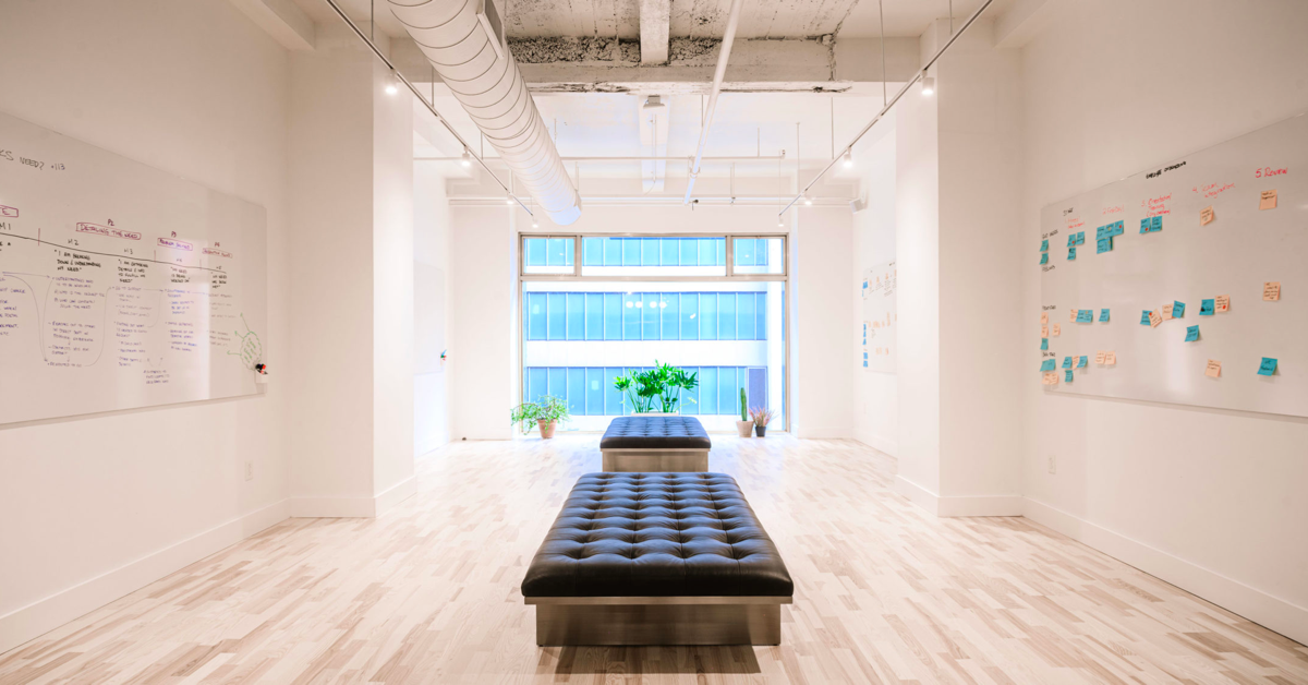
One of the guiding principles that helped us through these choppy waters was to clearly communicate what our brand stands for, including the beliefs that drive us and the value we provide to clients. This brand evolution wasn’t about tinkering with our logo and changing our brand colors. Instead we focused on messaging first and building an aesthetic that supported that message. We found inspiration in many places, including the new studio environment we designed for ourselves back when offices were still a thing and the Think-branded templates our teams use and adapt when presenting client work.
Setting design goals
Before jumping into Sketch, we like to reflect on and set the high-level goals our clients have, along with what we hope to learn and explore as design consultants.
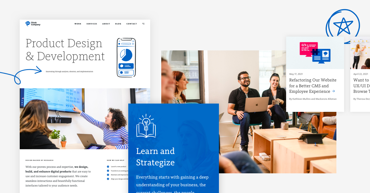
From a business perspective, our site needed to more clearly communicate our value proposition and what we do, while encouraging deeper engagement with our audience. From a design perspective, that meant creating opportunities to share key messages while setting reasonable constraints to prevent us from getting too wordy. This led us to show more than tell by featuring imagery of our work, team, and process prominently, reducing how much we needed to communicate through prose.
Additionally, we wanted this site itself to represent the caliber of work we deliver to our clients, even if they can’t see the site infrastructure first hand. Apart from enhancing the visual aesthetic, we wanted to develop a design system that can grow and scale with us over time. This meant redesigning existing components and building a solid UI library, all while working within the boundaries of our existing site structure and CMS. We know there will be a lot to add, tweak, and revisit in the future; this new foundation will allow us to shape the site as we move forward.
Tied to the aesthetic, we also wanted to rethink the way illustration is incorporated in our brand. In the past, we relied heavily on illustrations as a focal point for our services, core values, and blog posts. The new aesthetic uses illustration as a supporting player, enhancing and providing meaning to our work, rather than competing with it.
Using language to tell better stories
A key focus for us as designers was to frame and share our stories more effectively, particularly our case studies. During our last website redesign we wrote a lot of new content, but it didn’t always communicate a full story, forcing the reader to assemble the pieces themselves.
This time we made some conscious decisions when it came to storytelling, using many tried and true techniques:
- Opening with a punchy but brief lede that sets up the page and gets people scrolling
- Developing a consistent tone that feels familiar but offers something unique on each page
- Distilling our messages down to be more direct and succinct
- Converting paragraphs into more engaging layouts and graphics
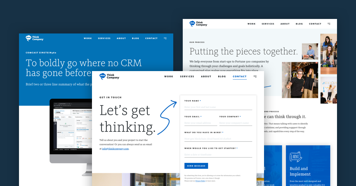
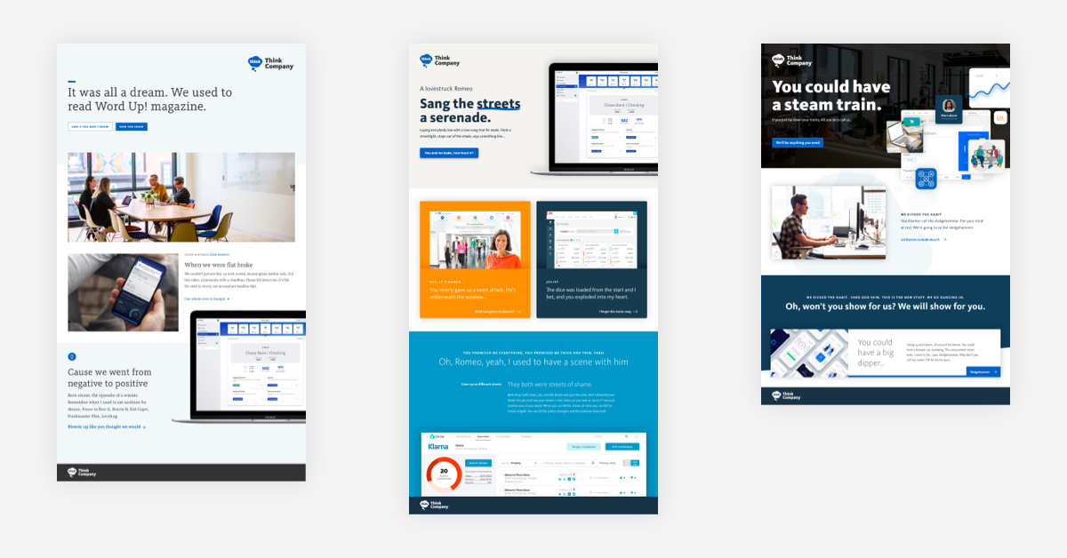
You can see this specifically in our case studies. We sought to play those up in a way that respects the quality of work, highlights the innovation and ambition of our clients, and acknowledges the challenges of scalability all the way from copywriting to development. We also looked for opportunities to “break the grid” by overlapping components on the page like text blocks and imagery. This approach can bridge two pieces of content together, transition from one thought to the next, and guide someone down a long page. Each case study was also branded with a unique color palette that set the tone for the story.
Aligning on a shared creative vision
As designers, we’re always striving to deliver work that meets our personal standards given a project’s potential within the amount of time available. We face these opposing forces on almost every project. The more vested we are in a project, the more tempted we are to nitpick, finesse, distill, and seek to reveal greater truths. Knowing these tendencies, we took steps to avoid that vicious cycle by relying on structure, feedback, and collaborative discipline.
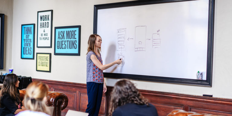
Returning to the idea of process, one of the biggest challenges we faced was getting the entire team aligned on a united vision at the very beginning of the project. Working together, we developed three different design directions via style tiles, moodboards, and a discovery deck, and presented those to the project stakeholders input.
Together, we determined which direction was most appropriate for our brand, and we had a solid framework to refer to when moving forward with the mockups and design system. Generating this level of alignment early in the project made the rest of the process relatively seamless.
Sweating the details
It typically feels like 90% of the work is to make the product good, while 10% of the work is to make the product great. The collection of small details make it us and, hopefully, makes it memorable. A survey of our project design team revealed some favorite elements of the final design. See if you can spot examples of these on the live site.
- “I love the way that our new illustration style mimics the way we collaborate and develop ideas in person: on whiteboards.”
- “Typography feels a lot bigger than a detail but there are a lot of really nice moments that happen with our pairings. I’m a sucker for small, tracked-out, all-caps, sans-serif faces. Pair those with a nice big but thin modern serif face…🤩”
- “I love it when we can sneak in a little bit of fun copywriting—a song lyric or a film quote and the way we use ‘think’ and ‘thought’ more throughout.”
- “I really enjoy the way the Think bubble in the footer breaks outside the top arch.”
- “I’m a fan of the new illustrative details”… says our illustrator!
Insights from our redesign process
Like any project, passion for the craft and excitement about the end result are strong motivators for us. That was definitely true for this website redesign. From the outset we all saw this as a big opportunity to take the brand into its next chapter.
Because of this, we made an intentional choice to treat this like we would a client project—same priority, same structure, same accountability. We always tell our clients that investing in your brand and online presence is more than self-indulgence. It’s a literal investment to set your business up for future success. We brought in a project manager, followed our process from research to vision to execution, and collaborated closely with our development team from start to finish.
Fully-remote teams can work successfully
Since this project took place during late 2020 and into 2021, we operated as a fully distributed team. Before thinking about pixels, we started with “just enough research,” set a vision and goals with our stakeholders, and explored several aesthetic directions. Through a series of refinement exercises with stakeholders, we landed on our final direction and moved into a series of traditional design sprints.
Even though we’re used to a lot of in-person collaboration, our standard tool set—including Miro, Sketch, Abstract, InVision, Jira, Slack, and Zoom—served our needs well and eliminated the friction of remote collaboration.
True teamwork and collaboration are essential
We’re big on team dynamics, and that certainly contributed to our success in a way that can’t be overstated.
Early on we aligned on the aesthetic direction and tone, and respected the unique perspective each team member brought to the table. We held casual daily check-ins that helped bring those things to bear, especially when working without the ability to peek over someone’s shoulder or pop by their desk for a minute thanks to the pandemic. With a little time each day we could cover off on small details or full-page concepts, and share and integrate things we discovered.
Team encouragement flows naturally from a positive dynamic, but more importantly, mutual trust allows us to challenge each other and workshop different ideas in a welcoming way.
Taking a structured approach helps you reach the finish line
Finally, we found that treating ourselves like a client also helped to check ourselves before giving into a “just one more thing” mentality. The looming deadline, even though it was self-imposed, forced us to commit to an outcome and move on to a new thing.
An enhanced website that aligns with business goals
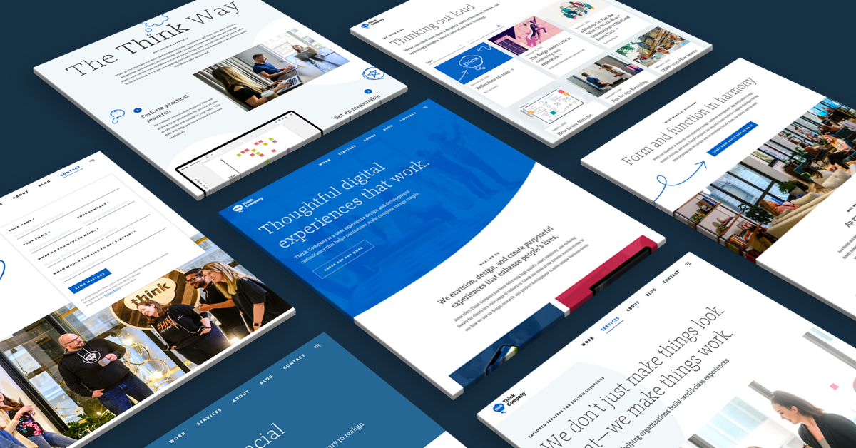
Now that our newly-redesigned website is live, we have an evolved digital brand asset that highlights our work, better represents the way we collaborate with our partners, clearly expresses the value we bring to our clients, and represents who we are as a company. Redesigning an essential digital tool like a website can be an impactful process for any business, and we’re already seeing immediate results in the form of having strong stories, differentiators, and visuals to share at our fingertips. Most importantly, this evolved version of our site sets us on a path to tackle our future business goals with a strong digital asset at the center of our efforts.