Avoiding expensive errors with better user interface design


Citibank recently lost a $500M lawsuit because of a poorly-designed banking interface. As it turns out, they mistakenly paid off a loan on behalf of their customer, Revlon, when Revlon only wanted to restructure the loan. Citibank caught the problem too late, and is now responsible for the mistake. Ars Technica tracked the issue down to poor user interface design in the Oracle platform FLEXCUBE.
There are two lessons owners of enterprise business systems can learn in the wake of this expensive error:
- Your employee experience becomes your customer experience – This story is a prime example of how challenges in your employee experience become major liabilities to your customer experience. Revlon dodged the bullet because they didn’t make the mistake—but Citibank is clearly a customer of Oracle, and I’m sure they’re not happy that the design of FLEXCUBE contributed to this fiasco. This article isn’t about listing the issues with FLEXCUBE, though—it’s only one example of a sea of complex transactional business systems that have not changed with the times, and the risks of letting your business software stagnate.
- Business systems should be as usable as consumer products – I am sure most of you engage in some type of digital banking, and it’s very likely many of you either file your taxes through a consumer tax product or your accountants use a professional tax product. While our personal financial transactions are nowhere near as complex as those in high finance like Citibank, there is a lot that these types of companies can learn from the consumer experiences we encounter every day.
If you’re looking to avoid mistakes like this at your own company, here are my recommendations for ways that you can use modern UI/UX practices to build and maintain complex transactional business systems. These tips will make systems more efficient, and—most importantly—help the people using them make fewer mistakes.
Transactional business systems are inherently complex
A quick Google search reveals a massive library of dozens of manuals on how to use all of the modules of FLEXCUBE. The user manual for Universal Banking deposits alone is 174 pages long. The massive scope of the platform makes for a very complex system. Just because the system is complex does not mean the experience needs to be complicated.
Enterprise products like FLEXCUBE rely on the assumption that users will either memorize a manual, or they’ll access it the moment they need it. You know, kind of like how you read your vacuum’s user manual every time you need to switch the upholstery attachment for the crevice tool. Oh, you don’t do that? Nobody does! User manuals exist primarily to mitigate liability, not to improve your experience. It’s the industrial designers who make sure you know how to switch out components.
To triple-check on large transactions, Citibank instituted a human review process that involves three people reviewing the transaction before it’s executed. That makes sense for a $500M payment. But the purpose of a multilayered review process is to identify mistakes. If the reviewers don’t know how to hack the form for a unique transaction, it’s not their fault—it’s the system.
Consider using progressive disclosure
Bank transactions can be complicated. In the early days of transactional systems, they modeled the real-world forms that were used to document transactions. You can see remnants of this by walking into any bank. At a table in front of the tellers are a collection of 3 or 4 forms that represent 90% of the transactions bank tellers execute: applications, deposits, withdrawals, etc. Tellers take your form and enter that data into a system that probably looks a lot like the form you filled out. For more complex transactions, you sit at one of those desks, where a banker calls up a different, more complex form. The banker is very familiar with this form, and she asks you detailed questions about your transaction in order to fill out the form correctly.
The questions she asks are progressive disclosure in a human format. She reacts to your answers with different questions and she only asks questions that are relevant, even though the form has a bunch of fields she’ll ignore.
Progressive disclosure helps prevent mistakes, and it’s been around for a long time in consumer products. Intuit’s TurboTax uses a conversational method of progressive disclosure. Rather than rely on your ability to fill out your 1040 and myriad of sub-forms and schedules, TurboTax asks you questions and fills out the forms in the background. Intuit manages a wealth of financial products, including professional products like QuickBooks, all of which rely on progressive disclosure as a central practice for improved user experiences and reduced error. Here’s an excerpt from their design system:
Progressive disclosure lets us organize content with the user’s needs in mind. If users are completing a multi-step task, we need to give them just enough information for the immediate step they need to take. If users are browsing through a large amount of content (especially, say, on a smaller screen), organize that content in categories that make sense to users and what they need to know.
Progressive disclosure doesn’t preclude the need for a manual, it simply repurposes content to live within the interface and provides a help feature that’s structured and written to support the stage you are in.
In a system like FLEXCUBE, conversational progressive disclosure could start with the loan payment workflow. When the analyst indicates she’s processing a loan payment, the system would ask, “Is this payment part of refinancing a debt?” When the analyst responds “yes,” she’d enter a branch of the workflow with specific questions about refinancing. Instead, in the Citibank situation, the analysts were left to engineer a hack involving fields with obscure titles and checkboxes.
Many systems allow you to subvert progressive disclosure to access the actual forms in case you need to make very specific changes not covered by the workflow. Think of this as the “expert mode.” 99% of the time, you won’t need to get to your Form 1040 Schedule EE, but when you do, it’s right there.
That isn’t to say that progressive disclosure is the solution to all problems. It is simply one of the many methods a team can implement to improve efficiency, accuracy, and employee experiences. If your only pattern is filling out forms, your business is never going to evolve.
Use plain language whenever possible
It’s difficult to avoid jargon in large, complex business systems. It’s also very likely a requirement of the job to have a strong working knowledge of that jargon. The presence of jargon in your system does not mean that you should avoid using human language to provide context for the transaction.
In the Citibank example, the transaction Citibank intended to execute was to pay the lenders their share of the principal and interim interest owed as of August 11, 2020, then to reconstitute the 2016 Term Loan with the remaining lenders. The screen to execute that transaction looked like this:
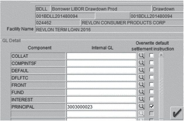
According to Ars Technica, what should have been done was to check the boxes and enter account numbers for the Front, Fund, and Principal fields.
This issue could have been resolved by the system asking what type of payment this is, then presenting only the relevant fields along with plain language asking for details. While there’s no complex loan payment screen in TurboTax, here’s one example of how they use plain language in a complex interaction:
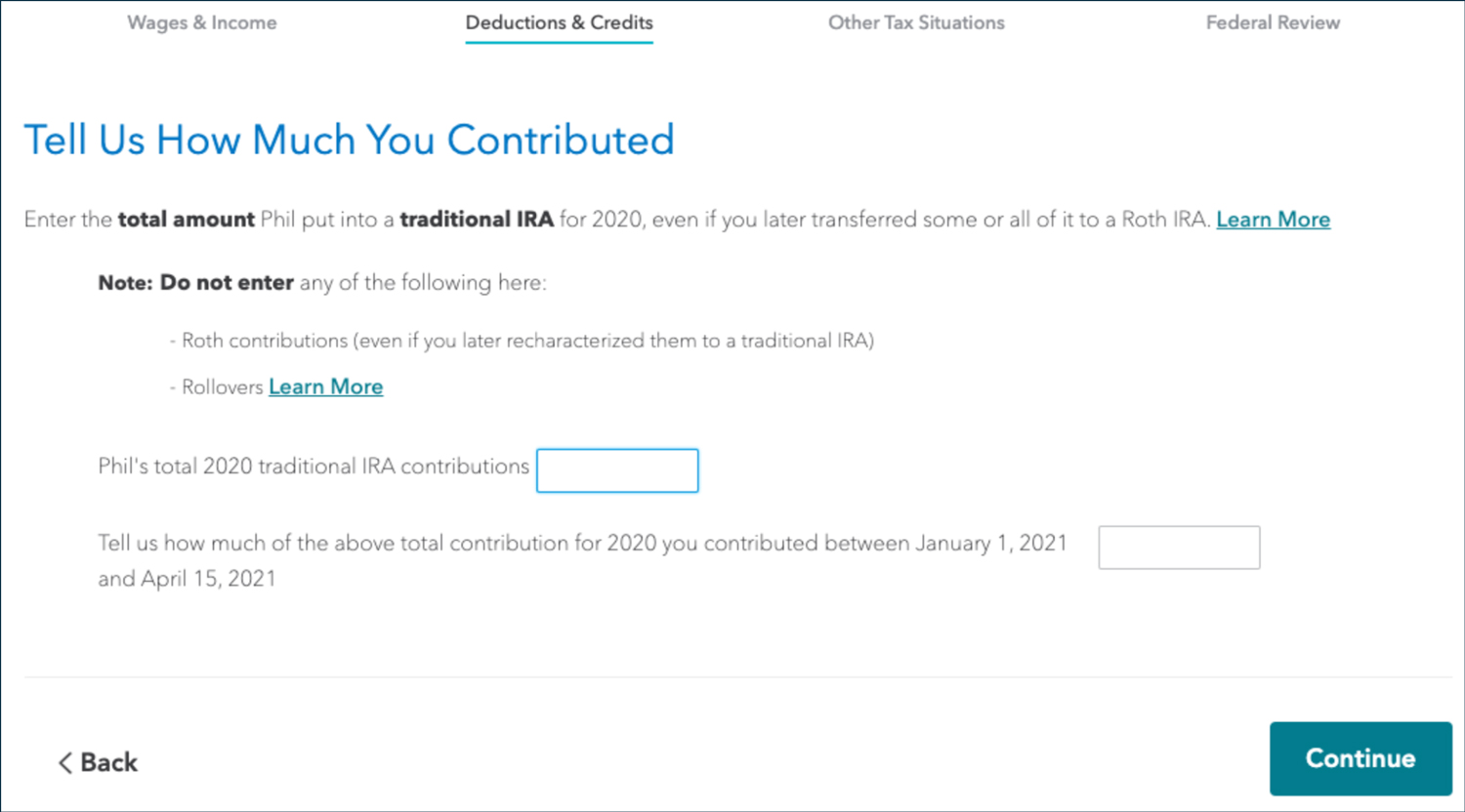
This TurboTax form uses jargon, but frames it with conversational language, bolds critical terms, and provides links to learn more if the user is confused.
Implement a design system to keep your business systems consistent
A critical element of establishing any intuitive system is consistency. Imagine a system you use multiple times an hour while you work. You don’t have to think much about most of the clicks and taps you’re executing. We refer to this experience as “muscle memory.” I can’t tell you where the “Compose” button is in my email interface—not because the system is unusable, but because I don’t have to think about it anymore.
Establishing the consistency needed for that kind of intuitive interaction is the responsibility of an entire team—not just designers. Content creators need to know the styles and content patterns to follow and interface engineers need to agree on the best, most accessible method to code these patterns.
As your team establishes design, code, and content patterns, they need a centralized place to communicate and govern those patterns. Indeed, Oracle publishes their Alta UI system publicly, as does Intuit and many other organizations. Unfortunately, FLEXCUBE does not appear to be Alta UI compliant.
A centralized design system serves many purposes, including:
- Ensures and demonstrates your commitment to consistency to your customers
- Provides standards and processes for your employees, contractors, and agencies
- Demonstrates to your team the importance of using and maintaining the system
Design systems do not constrain teams. Rather, they help focus teams on continuous improvement and identifying new challenges rather than reinventing the wheel.
Mandate user testing in your product design process
I have enough experience designing systems for regulated industries to know the product testing process for a product like FLEXCUBE is rigorous. There is no room for system errors when your platform moves billions of dollars daily. Far too often, where product design processes fail for complex transactional systems is in regularly assessing the usability of the product.
The most common method for doing this is in scenario-based usability testing. Put a few humans in front of the software, give them a scenario such as, “make a payment on this loan while refinancing it so the principal washes to an internal account.” Watch them make the transaction, record their questions and challenges, and resolve any egregious errors.
That is not the only way, though. Product teams have developed sophisticated methods of analyzing how your entire user population is using the tool to identify what works and what needs improvement. For example, if the system detects that 30% of your users are accessing help from the same screen, you can analyze their help queries to determine what they find challenging. If you have a couple of potential solutions to the problem, A/B testing allows you to push out different designs to different test groups and use analytics to see which one incurs fewer issues. All it takes is a UX measurement strategy and a few analytics experts.
Product owners often encounter resistance to usability testing from their sales and marketing teams. The most common objection I have encountered is that if you ask your users to help you improve the interface, you are admitting your product needs improvement. Conducting usability studies actually has the opposite effect. Asking people to help you improve a product develops more loyalty to the product by showing people you value their opinion.
Institute Agile methodologies to continually improve your business systems
When I see the massive library of manuals for FLEXCUBE and wonder why it’s not yet Alta UI compliant, I feel for the executives and product owners at Oracle. Redesigning enterprise systems is not just talking about changing the tires on a bus while it’s moving. It’s more like building a bunch of new buses that are attached to the old bus which also, by the way, needs a new engine to pull all those other busses around.
Inevitably, a year into the project, leadership will start demanding progress to show shareholders and the market that it was the right decision. These are some of the challenges that the original Agile manifesto was authored to address.
It’s a daunting task to think how you can deliver a redesigned enterprise system, but the answer can’t be to freeze the product and build a completely new version from scratch. When an organization first institutes Agile, they lose sight of the principles laid out in the original Agile Manifesto: working together, maintaining velocity, and delivering working software frequently.
Something that Agile teams are exceptionally good at is identifying quick, achievable success points that can be layered on top of an existing product. As those small efforts grow and morph together, the team learns about the larger challenges that need to be addressed.
For massive, complex systems, you are more likely to see success in proofs-of-concept at the beginning of the project. You may hear things like, “the next epic focuses on creating a progressive disclosure UI for this very simple form.” While that sounds incredibly simplistic, it likely involves many complex activities such as writing APIs, standing up a CMS to store UI content, prototyping and testing interfaces, and building accessible UI elements. While executives may be unimpressed after four months of hard work results in a simple working prototype, the team knows that they can now hand those methods over to a production team that can now convert dozens of forms in a single sprint.
Soon, your proof-of-concept evolves into an MVP which evolves into your new product—without any of the code freezes and delays that send your customers elsewhere. After your Agile team has tackled the transformation of the product, with well-maintained design systems and content strategies, they can focus on the things that product managers and product owners really want to do: continually reacting to customer needs and market trends so your customers are better protected from $500M mistakes, and your product never becomes stale again.
Good design pays for itself… and earns interest
The transactional business systems at your organization will always benefit from applying modern design principles and evolving at the same rate as customer-facing interfaces. The people using those systems interact with countless digital tools and systems every day outside of work, and will experience the tension created by complicated, outdated internal systems that don’t prioritize good design. Without a focus on modern UX/UI principles, you may even be setting yourself up for mistakes that outweigh the cost of regular design efforts and maintenance.