Successfully Champion Your Work & The Value of Design


After teaching design for 8 years in higher education, I recently jumped back into industry to pursue user experience design at Think Company. I’ve noticed several overlaps between UX and design education, particularly in the presentation of my own designs, and more importantly in the communication of the value of design at large.
Both fields require intelligently articulating the problem, what was done, why it was done, and how that will affect future work and the overall vision—in a manner that others (whether they be students, clients, or users) can easily digest and make meaningful use of.
Of course, effectively articulating our work and its value can be tricky. As designers and/or champions of design, we often find ourselves in the following scenario:
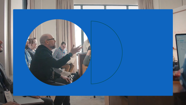
It’s the big day, your team is geared up and ready to present a solution to the client. Your solution is strong. It magically solves both user needs and business needs, differentiates itself from competitors, and leverages technological capabilities, all within the budget and timeline. You’re presenting to a room full of designers and non-designers, some of whom are decision makers, some who are not, some with lots of familiarity about the project, and some with none at all.
 As the presentation unfolds, despite your killer solution, you realize that the room is getting away from you—folks are overlooking important features, focus is being misdirected, and goals seem to be misaligned. By the end, you’re left with lots of misunderstanding, sometimes subjective and contradictory feedback—which all leads to ambiguous next steps.
Sound familiar?
This was also a common scene in academia. I’d put my all into writing a killer project, crafting the most eloquent lecture, proposing a new idea to my colleagues… and yet, things didn’t always unfold as successfully as I would anticipate. I learned early on that the way I framed collaborative experiences had a significant impact on the outcome—often having the power to mitigate other factors such as student engagement, resources, timing, etc.
Through my experiences in academia and industry, I’ve found the following approaches help me become a stronger advocate of design, and by extension, my own design work:
Design the meeting experience.
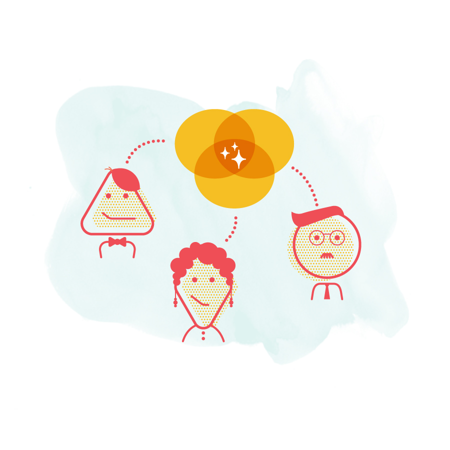
Think about communicating your design as you would any UX challenge. Recognize that meetings and presentations are simply face-to-face interactive experiences between humans, and can be very powerful. Designers are constantly thinking about their users, developing empathy for their needs, pain points, and motivations. The same empathy and understanding should be established for stakeholders, clients, and team members. Just as you would focus on user needs when designing a digital experience, remind yourself who you’re presenting to. Marketers? Developers? Leadership? Make it a point to know what each participant’s role in the project is, the perspective they bring, and what is top of mind for each of them.
Once you’ve tailored the presentation to people involved, include a review of the goal of the meeting, the use case(s), and the criteria for success. Reestablishing these ensures collaboration begins from a shared understanding—of the project scope, the goals, the users, and each other. Building a shared understanding enables collaborators to focus on the most important aspects of the design. Like UX design, effective presentation comes down to reiterating the context of the challenge, building a common vision, understanding exactly where user is, and meeting them there.
A little work up front can make a big difference.
A lot of knowledge and careful consideration goes into creating your designs; give your presentations similar attention. Be prepared to explain your recent design decisions and changes from the perspective of how they affect the user. Ask yourself three questions:
- What is the problem?
- How does it affect the user?
- Why is your solution better than the alternatives?
If you’ve done this, have supporting research available so you can justify decisions objectively. If you haven’t conducted research but are employing best practices, be ready to explain these practices achieving similar goals in comparable scenarios. Rehearse if you need to, perhaps write it out in advance. I still find it helpful to spell things out by listing each design decision and how it affects the user.
No matter in which phase of the project you’re presenting, have some supporting process visuals at the ready. Even low fidelity documents, diagrams, sketches, mood boards, etc. are useful explanation tools when questions arise. In addition, if you’ve had previous interactions with the same people, reflect on those and try to anticipate potential reactions and concerns.
Tell a story, and use the story to facilitate conversation.
Designers create beautiful digital experiences through powerful storytelling. Presentations should also leverage storytelling. Frame the use case by setting up a narrative using a persona, their particular needs, attributes, and circumstances. Walk through the experience as that person would, making sure to emphasize the most valuable features. Beforehand, plan out your user story, identify the key milestones (aka your design decisions), and be ready to explain how each milestone affects the user.

Consider leading with the punchline—the solution—and then backtracking to discuss why. UX designers tend to approach work in a procedural and logical way, so it’s tempting to craft our presentations the same way. Leading with a “sneak peek” of the solution can help grab attention, instill confidence, and jump start conversation.
Finally, avoid using jargon. Be able to meet your audience where they are, but in a way that maintains your status as an expert. People think you’re smart if they understand you.
A few additional tips and tricks…
Establish roles.
If you’re presenting with a team, whether in-person or remotely, separate presentation responsibilities from everything else (leading, taking notes, assisting etc.) and clearly define who owns what.
Leverage InVision.
InVision is a great presentation tool. Whether you’re presenting sketches, mood boards, or actual prototypes in a tool like InVision, you can use it to organize different approaches. Consider creating a “home page” for your presentation that allows you to move between approaches.
Always recap.
Whether in the meeting, or after the fact, summarize the outcomes of the discussion to ensure everyone is on the same page moving forward.