Google Analytics: This Beta Needs Better Data Visualization

Google Analytics recently launched a new interface (in beta, of course). Sadly, for a tool intended to help its users understand and process data, they have done very little to improve the data visualization tools built-in to the application.
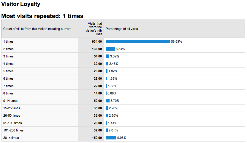
Let’s pick on the Visitor Loyalty graph, which has always bothered me. It looked like this:
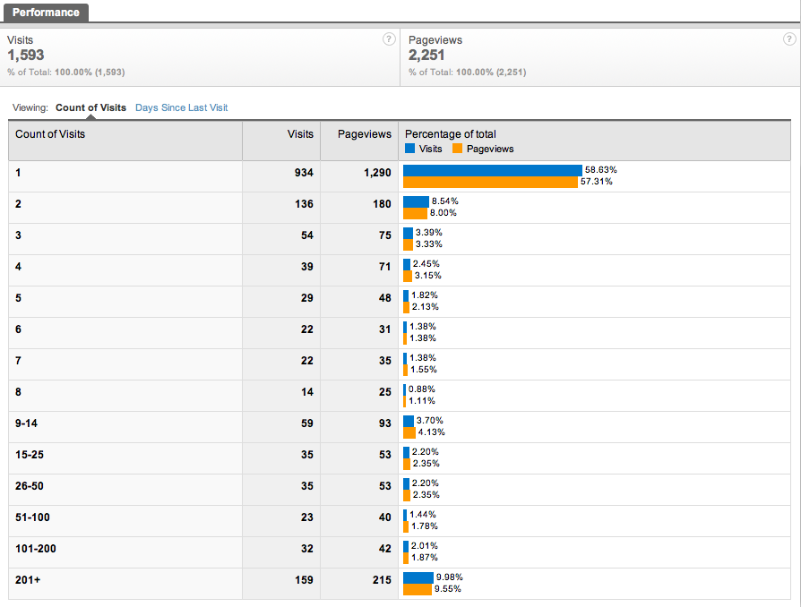
And now, the new-and-“improved” graph looks like this:
The only thing Google improved here is changing the name from Visitor Loyalty to Frequency & Recency. The concept of “loyalty” is relative to your users, their goals, and the context of their usage, so frequency may not even be a good indicator of loyalty. For example, a loyal Google user may visit google.com more frequently than a loyal Amazon user visits amazon.com. However, a loyal Google user probably views less pages per visit than a loyal Amazon user. That does not mean that either user is less dedicated to the site, they just fulfill their needs in different ways.
So, the name change is good, but what has bothered me most about the old graph still hasn’t been fixed. My concern is that it’s virtually useless to anyone who spends time with it, and misleading to anyone who only glances at it.
Apples Meet Oranges
If you look down the left side of the graph, you’ll notice that the scale is all wonky. It goes from 8 visitors to the range 9-14. This weird incrementing creates what appears to be a bump in the data around 9-14, when it is probably a smooth curve if you map it out correctly. If that’s not confusing enough, each range is different. Another way to express the increments they are laying out would be: 1, 2, 3, 4, 5, 6, 7, 8, next 5, next 10, next 25, next 50, next 100, everything else. So, while the bump at 201+ may cause an initial wave of euphoria, you soon realize that the 159 visits in that bump are probably spread evenly between 201 and 360.
(Before you ask, I’ve checked across all of the high-volume and low-volume sites we monitor for our clients. The wonkification of the scale doesn’t change.)
I get what they are trying to do. Loyal users will show up in clusters around one of these increments, but when the increments continue to adjust along the span of data, it’s impossible to compare one chunk to the next. What seems to be bumps are probably nothing, but there’s no way to be sure. There cannot be a generic benchmark for frequency that applies to all sites. Trying to genericize a graph using arbitrary increments is a disservice to the data and only misleads your users.
So, how would YOU do it, Phil?
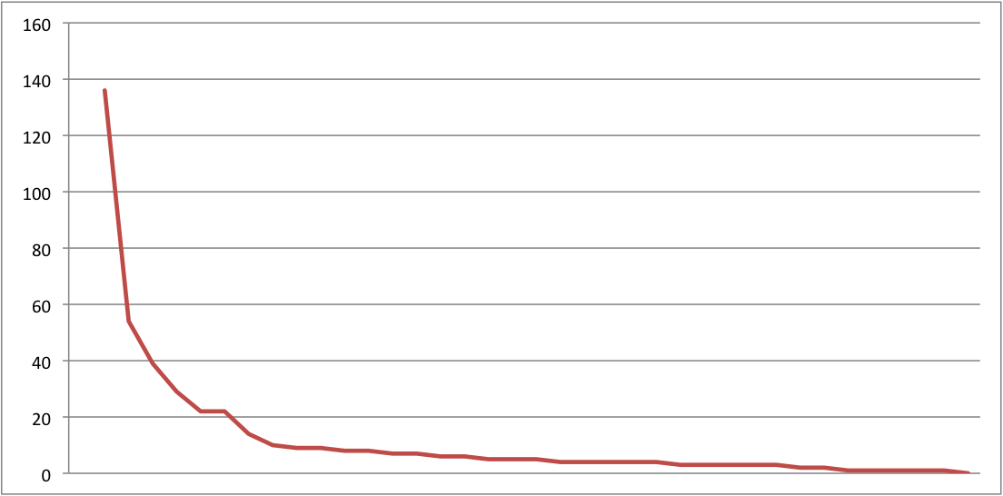
Well… the first thing I would do is make it a line graph to generate a smooth curve with a consistent scale from 0 to X, where X is the most number of visits recorded. That’s easy to do and Google Analytics uses line graphs elsewhere, so we know they have the graphing capability. It would look kinda like this:
OK, Phil, why is THIS better?
It’s better for me, but maybe not for everyone. It depends on what you need to do with the graph.
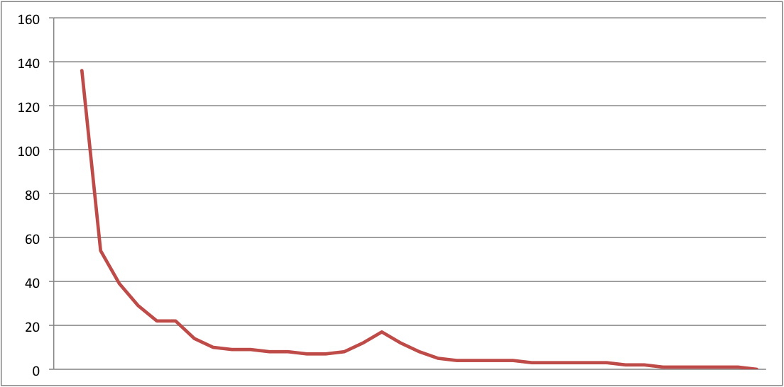
I was once asked by a client to briefly explain how I find odd things in their analytic data before anyone else. There are many different reasons to be looking at analytics reports. I play a troubleshooting role on that team, so my answer was simple: “I follow the trend line and look for aberrations. If I find one, I dig into the data to find the root cause. Then I call you.” The chart above wouldn’t set off any alarms, but the chart below would cause me to dig:
That peak would make anyone wonder what’s going on, but with the bar charts that Google uses, that peak would end up buried inside one of the wonky ranges.
But that’s only how I would use it for a role I play on a specific team for a site that has unique needs. That’s the weakness of the Google Analytics interface that I was hoping they would fix. I want to be able to customize their charts like I can in Excel. Sadly, the data visualization tools they offer in the new interface aren’t enough. Even more sadly, when I export the data from the wonky chart, it retains the bizarro scale. So even if I wanted to use my own charting software, the data is garbage. To quote my film editing professor, “garbage in, garbage out.”
What Would Tufte Do? (WWTD)
When I encounter poorly communicated data, I ask myself, “What would Tufte Do?” Edward Tufte has authored several books on data visualization. While his work has sparked much debate, I believe he would have a lot to say about the use of bar charts for something like Loyalty or Engagement.
You see, even though the charts presented by Google Analytics are missing the chartjunk Tufte has railed against, they rarely communicate data in an appropriate manner. A bar graph is absolutely the wrong tool to use to analyze this set of information. To select the appropriate mapping of this data, you first have to ask yourself, “What is the user going to do with this data?”
For something like engagement (which Visitor Frequency hints at), you may want to know:
- What are the behaviors of an engaged user?
- Are we losing, gaining, or keeping a consistent level of engaged users?
Both of these would require completely different visualizations of data, but neither is served by the out-of-the-box graphs presented by Google. My gripe about the out-of-the-box graphs in Google Analytics is that I often can’t figure out what they are trying to tell me, and they don’t let me customize the graphs to meet my needs.
We are entering a period where strong data visualization is getting a lot of attention. It’s more than making pretty pictures, it’s making images that provide value and answer questions. Google Analytics is a valuable tool for an unbeatable price, but when a new version is launched and the greatest value you’ve added is a UI facelift, you’re kind of missing the mark.

