Field Notes: Data Visualization Conference

In the wake of several large-scale data visualization projects, I decided to see how other large organizations were tackling the same challenges by attending The Innovation Enterprise Data Visualization Summit last week. Rather than a play-by-play, I thought I’d give some of my general insights about Data Viz, further inspired by the experience:
Data Visualization is Not New
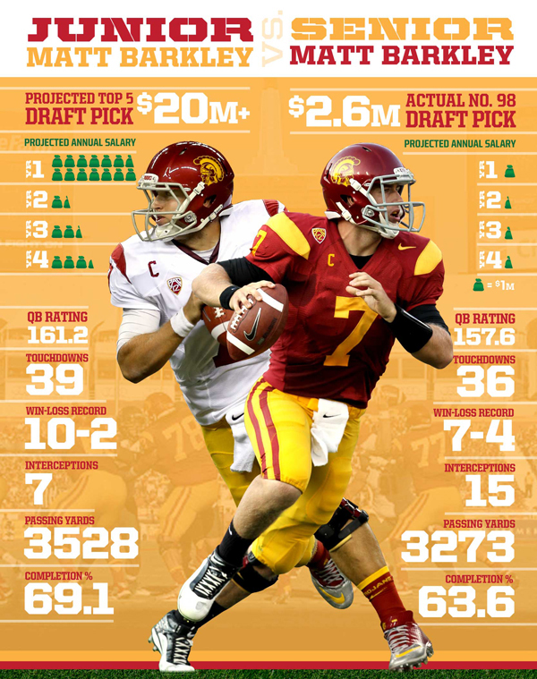
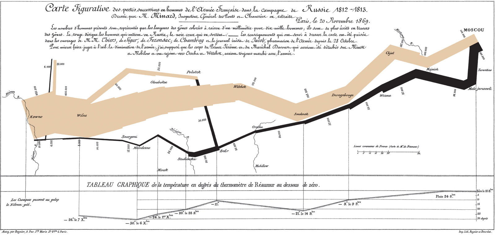
Something we need to remind ourselves repeatedly in this industry is that a lot of what we do is not new, it’s just been renamed. A few presenters reminded us of this fact by pulling out Charles Joseph Minard’s image of Napoleon’s March on Moscow from 1812 (a print of which hangs prominently in one of our meeting rooms) and John Snow’s Cholera Outbreak map from 1854. These are great pieces of Data Viz history, but I’d say it’s safe to leave those images out of your next data viz presentation. Not that they’re irrelevant, I just feel like you’re preaching to the choir.
What is new is the ability to present highly manipulable, interactive visualizations to the user. In the early days, we’d either render images manually or employ expensive server-based tools to do it and then shoot them down to your computer. If you wanted to see it in a slightly different format, well, that required a lot of timely re-rendering. Your other option was to download data and play with it in Excel.
Today, we send well-formed data to your machine and let you play with the visualizations. This introduces serious potential usability issues, as it does any time we give more control to users. The trick is to give them that control but prevent them from shooting themselves in the foot. Krystal St. Julien from ModCloth led a great discussion on how their analytics group is doing just that.
The Sexiest Thing To Do With Data
Above all else, a clear, understandable visualization is always your goal. At two different sessions last week, presenters apologized for using simple graph types rather than something more provocative or sexy. The interesting thing was that the graphs up on the screen clearly conveyed the data. A line chart is almost always the best way to show a trend over time for a single metric, so we need to stop apologizing for it. Spend your time making it as clear and understandable as possible. To do this, find visual designers whose work demonstrates a clean, minimalist approach.
Again, this isn’t new. Dieter Rams reminded us years ago that good design makes a product understandable, is unobtrusive, and is as little design as possible. Stephen Few gives us similar advice for designing data visualizations and dashboards: as users get more control over the data visualizations they want, we’ll need to be more conscious about helping them help themselves. We can’t always stop them from making mistakes, but we should create tools that guide them well.
Data Scientists Are The Real Deal
Here’s what I learned above all else: companies that are serious about making data-driven decisions hire data scientists. These are folks with a strong background in statistics, analytics and computer science. It’s been years since my last stats class, so I can’t tell a Chi-square from a Gamma distribution, but they can. That’s why designers need data scientists.
Data scientists need skilled experience designers too. Our role is to work with them on one common goal: let the data tell the story. This isn’t an easy task, especially when you’re dealing with massive stores of data. How do data scientists make the world a better place? Here are a few examples:
Mohan Dorairaj at eBay analyzes ridiculously large sets of user data to constantly improve the eBay user experience.
Brian Wilt and the Jawbone UP device are currently running the world’s largest sleep study. Y’know what single event has the worst impact on sleep in the US? Daylight Savings Time. They built Up Coffee in three months. After three days of using it, I cut back on caffeine by 50%.
Michael Conover at LinkedIn digs through analytics for many reasons, one of which is to identify behavior patterns of spammers and recruiters so your LinkedIn experience can be more about networking and making connections than fending off unwanted solicitations.
Folks like Ahmad Yaghoobi at Boeing study bird strikes to protect the lives of people in their planes.
Clayton Clouse helps folks at FedEx identify previously unseen patterns in package delivery times so you get your stuff faster.
And while not a data scientist, Heidi Roller over at Fox Sports Interactive embodies the need to fuse design and data. She uses her storytelling background every day as she converts dense sports data into visual stories.