Responsive vs. adaptive web design: What’s the difference?
Remember the days before tablets and smartphones? Building a website was pretty straightforward then. Having an “online presence” was the goal, and you really only had to account for a desktop—and maybe a laptop—computer screen.
But the iPhone changed that. Accounting for mobile, tablet, laptop, and PC screens is now vital to web design projects. A user will quickly abandon the site if a webpage doesn’t display correctly. Every website needs to be optimized for a range of viewports.
There are several approaches to doing this, but we’re going to focus on two primary methodologies: Responsive and adaptive design. While both are intended to solve the same problem, they use different strategies. We’ll talk about the differences between these methodologies so you can find the solution that works best for you and your platform.
What is responsive design?
Responsive design creates a website with content that looks great on all viewport sizes—from XL desktop down to mobile—using CSS media queries. This includes landscape views for mobile and tablet. The opposite of responsive is a static webpage (like when you try to view a website on your phone and it’s just a miniature version of the desktop site).
Without responsive design, if the user is accessing the site through a device that wasn’t designed for, they’ll have to pinch and zoom, rotate their device, or they may have information missing completely.
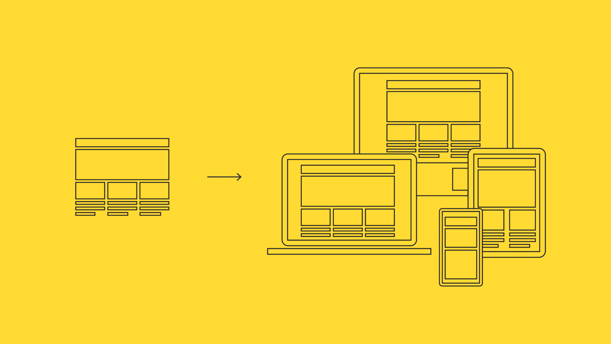
As the page content shifts depending on the screen size, so does the usability. In responsive design, designers and developers work closely together to ensure that the most important content is prioritized on different devices, especially at the smallest screen sizes (this is where you may hear terms like “mobile-first” and “progressive enhancement”).
Pros of responsive web design
There are many benefits to utilizing responsive design, including:
- Greater user satisfaction – The end goal for any design is that the product is usable and enjoyable. Designing for multiple screen sizes increases your chances of a happy end user who can do what they need to do on your site.
- Streamlines your development process – Since responsive design utilizes similar HTML for different viewports, your developers only have to create a single source of truth instead of writing and rewriting code for each screen.
- Plug-and-play components – When you build content and components using responsive design, these assets can easily translate into other areas like mobile apps, wearables, and beyond. You’re making life a lot easier for yourself in the future.
Cons of responsive web design
Responsive design does have some drawbacks to take into account.
- Page load can sometimes be slower – In responsive design, it’s essential to be mindful of the type of assets you are using. With images, for example, it’s vital to consult with your developer to understand the appropriate amount of compression or resizing a given image needs so it won’t slow down your load times.
- Condensing content can be tough – Depending on the size of your website and the amount of content needed in navigation, condensing everything into a mobile screen can be difficult. Usability testing is vital if you have a challenge like this.
- Responsive designs aren’t optimized for only mobile devices – In a mobile-only environment, responsive designs could have poorer performance because the design was created with all sizes in mind. Even minor tweaks to make the layout fit the smallest screen width can feel less intuitive than an experience designed first and last for mobile.
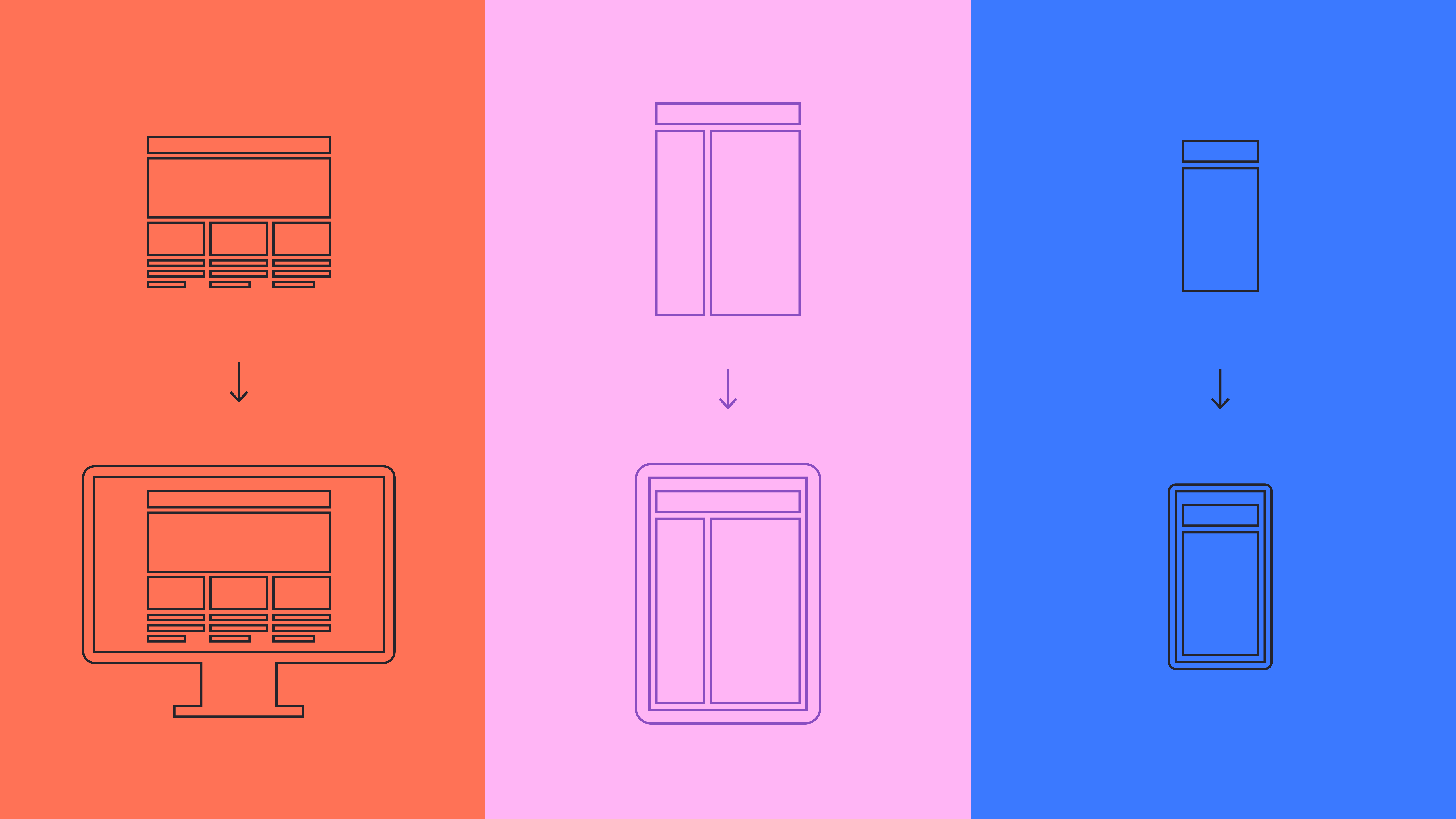
What is adaptive design?
In adaptive design, a different site layout is created for each screen size (PC, mobile, tablet, etc.). As your website loads, the code is written in a way to recognize the size of the screen and serve up the layout that was made for the corresponding viewport. More commonly, this approach may be used for eCommerce or sites with substantial user bases and amounts of content.
In theory, a team could retrofit an existing desktop site with a mobile experience. However, suppose an organization only has a desktop website. In that case, it’s an excellent time to evaluate with a design and development team whether you’re due for a more significant redesign that may include a responsive website.
Pros of adaptive design
There are some perks to creating adaptive designs, including:
- Great for large user bases – The larger the user base, the greater the case for optimizing between small and large screens. For example, if most of your audience is accessing your content on an iPad, it may warrant building an iPad-specific design to give your users the best possible experience.
- Can perform better – If a website is optimized strictly for a user’s specific viewport, they will have a more performant experience.
- Greater marketing opportunities – If your marketing team knows what device a customer uses, targeted ads can be further refined according to the device.
Cons of adaptive design
There are some difficulties inherent in adaptive design.
- Difficult to maintain – In an adaptive design, when you add content to a given page, your developers will need to create at least two different HTML templates/CSS per site. This can be time-consuming and repetitive, and creates opportunities for error.
- Costly – Because adaptive design requires a lot of maintenance, more time and developers make it more expensive. Some companies build separate, sizeable budgets just to allow for the maintenance of their adaptive designs.
- It can be unnecessarily difficult – Adaptive design is a precise tool that meets a specific need for a particular type of use case. But in our experience, most companies find it unnecessary, requiring more overhead than it’s worth.
What is the difference between responsive and adaptive web design?
Responsive design is the industry standard and handles all screen sizes. Because of this, there’s a low barrier to entry and a low level of effort required from the frontend developer. Responsive design is more efficient, cost-effective, and still considers different user needs.
Adaptive design is a great way to make the best experience possible for a given viewport. While it’s more complex to build and maintain, adaptive designs are priceless if you have a large user base and want to utilize personalization opportunities best.
How to choose between responsive and adaptive web design
While most organizations now will default to responsive design, there are a few questions we ask at the start of a project to make sure this is the right way to go.
- What kind of users are we talking about? B2B or B2C? Are they consuming retail content, or are your users internal sales reps at your company?
- How many users do you have?
- What sort of devices are people using when interacting with your site?
- Are you utilizing mobile-specific marketing tools like targeted mobile advertising? Do you use a lot of mobile intake forms? What about mobile shopping?
Timeline, budget, and complexity of needs all play a role in deciding between responsive and adaptive design for your website. If your needs are mixed, have you considered a hybrid approach that gives you the best of both worlds?
Leveraging adaptive and responsive design practices with Think Company
Responsive design meets the needs of most of our clients at Think Company. Organizations and teams love the streamlined approach, lower complexity, and designs that transition seamlessly across devices.
But adaptive design is a stellar methodology for specific use cases, and we always keep it in mind. We can find ways to cherry-pick some of the best adaptive design features and apply them within a responsive project. The trick is knowing your users, asking the right questions, and making informed decisions for your website.
Want help understanding whether adaptive or responsive design is best for you? Get in touch.