User experience is everywhere

Since I moved into the design industry six years ago, I’ve found myself having a whole new appreciation for my interactions and experiences as a customer.
In my first job out of college, I worked for a large financial services firm. While user experience (UX) design was not a focus for them at the time, they did a good job of working with their clients to make sure the customer’s voice was heard. They even established customer support groups for folks to share their experiences with one another, pool funding for enhancements, and weigh in on new product features. This input was invaluable in helping to prioritize the company’s roadmap and keep customers happy.
It wasn’t until my next job that I entered the wonderful world of UX design. Being new to UX, I quickly had a crash course in learning design terminology, understanding the design process in the context of a business setting, and discovering the ins and outs of user research. All of those things began to change how I viewed the world.
Since then, I can’t help but notice the details about every experience I have as a customer. Let me share a few of those so you can see how ubiquitous design is in our everyday lives:
Delightful experience: themed user icons (join.me)
Sometimes small features can have a big impact on an experience or brand. One example that jumps to mind is the themed user icons in the join.me conferencing application. From time to time, join.me updates the icons to go along with upcoming holidays or seasons.
![]()
These icons not only serve as a friendly icebreaker at the start of client calls (to see which icon you got), but also give us something fun to look forward to throughout the year.
While something like this feature is not likely to be part of an MVP release, it’s one of those small features that can pay dividends in incremental releases and elevate your experience for customers. When all else is equal, a little fun goes a long way.
Painful experience: airline check-in (Spirit Airlines)
UX design is not only limited to digital interactions, of course. While I was traveling over the holidays, I couldn’t help but notice how difficult the airline check-in process was for the discount provider I was using.
I observed people continually being surprised at the check-in counter about what they needed to do, when they could have been handling a lot of the process before they ever got to the counter. Apparently, the airline had too little staff on hand and neglected to invest in self check-in kiosks that could have streamlined the process tremendously (and saved them money, too).
Something as simple as a few signs providing a more clear overview of the process could have also saved time for the hundreds of people in line who were not familiar with this provider’s unique(ly convoluted) process. It’s attention to these seemingly “little” details that can ensure a more smooth transition from something like buying a ticket online (with all its fine print and exceptions) to an in-person experience at the airport.
Let’s end things on a high note with a seamless experience that spans channels.
Consistent cross-channel experience (Zipcar)
I recently starting using Zipcar, an on-demand car sharing service. After setting up an account, you receive a card in the mail which serves as your membership card and key to any car you reserve.
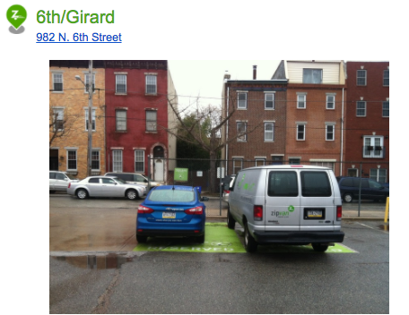
The multi-purpose membership card became just the first of many examples of good UX from Zipcar for each reservation, including:
- An email reminder with a picture of where the car “lives” (especially helpful in the city or unfamiliar locations)
- A membership card that serves as a quick way to lock/unlock your reserved car (which means not having to worry about losing keys), and
- A mobile app that allows you to remotely honk the car’s horn (in case you forgot where you left it in a big parking lot)
All of these details (and more!) were a clear indicator Zipcar put the time in to understand how their product would actually be used in context, which is the key (pun intended) to any great experience.
I hope these examples help inspire you to look closer the next time you interact with a product or service. You’ll see that even the smallest details of an experience can make a big difference in whether customers are delighted (and walk away with a lasting, positive impression of your product/service and brand) or driven to look elsewhere for something better.
Any top-of-mind experiences you’d like to share? Comment below!