Designing Digital First Impressions

When I scroll through my Twitter, Instagram, and LinkedIn feeds, I notice that we’re all meeting in the digital space almost as often as in the physical space. I already know the way that I act, speak, dress, and interact will influence the impression others form about me in a face-to-face meeting—and this same principle applies to my digital identity. Now that we’re engaging so dynamically online, how do we design the best first impression possible?
When meeting someone in person for the first time, I perform a series of actions: I smile, extend my hand, give a firm handshake, speak appropriately, and engage personally. As I move through this sequence, the other person listens to my words, watches my body language, and uses their intuition to understand my personality.
We all (consciously or not) expect and move through a similar set of steps in our digital interactions. When we see a new site for the first time, we’re assessing its likability, trustworthiness, and honesty—all the while trying to uncover the site’s personality and determine whether we feel safe or interested enough to engage emotionally. These are the same kinds of value judgments we make in face-to-face interactions.
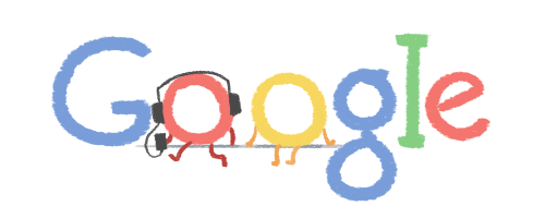
Digital experience designers understand this delicate dance, and carefully consider how to use the tools at their disposal to make the best (and correct) impression. For example, how does it make you feel when you see that Google has changed its Doodle to a Valentine’s Day edition with the “O”’s listening to music together?
Or—when Yelp can’t complete a search—how do you react to seeing a big purple dinosaur with the message, “Sorry, something’s funky with Yelp right now. Try again in a bit”?
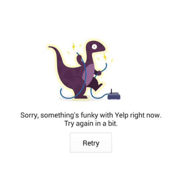
I know that I felt warm and fuzzy when I first saw the Google Doodle above, and I was more forgiving of Yelp for not being able to complete my search. Both interactions engaged me logically and emotionally, and they showed me that both sites have personality. But how did they do this so effectively? Was it just the little cartoon and cute wording, or is there something more?
Brian Cugelman, PhD (@cugelman), creator of the Psychology for Digital Behavior workshop, breaks it down into “above the surface (mechanics) and below the surface (principles)”:
“The mechanics are what you see and experience, the total effect. The principles are the things not readily seen or realized such as representation, credibility, charm, appeal, liability and similarity. When you understand the principles, you’ll then find the right mechanics for all emerging technology.”
Google has used holidays, historical milestones, birthdays, and other current events in their Doodles to help users form a personal association with the site or learn something new. Google also uses charm and likability in these first impressions, which evokes a positive reaction each time a user unexpectedly encounters something new.
Yelp also uses charming imagery paired with an honest message that’s easy for anyone to relate to and understand. During the normally frustrating experience of not being able to find what you need, Yelp utilizes these principles to turn a negative experience into something more positive.
Cugelman explains that we need to “chop up each theory and find the ‘active ingredients’ (principles) that are proven to work.” We have to design for the senses and evoke emotions based on the context of the thing that we are designing. Through deliberate design choices, designers can elicit very specific reactions from people and help construct a digital personality.
Google and Yelp have both established and proven utility, so it’s not the personality of these sites alone that creates the connection—but it does provide the extra smile and handshake that are often needed in the digital space.
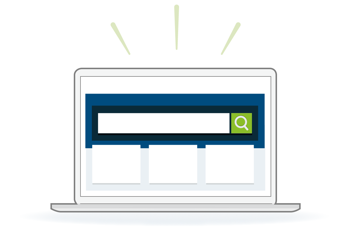
During a recent redesign project for a search-based website, the team here analyzed ways to make an emotional, yet professional connection. This scientific site needed to convey a personality in line with the nature of the content while also engaging users—soliciting trust while also highlighting the primary workflow and making content the main focus.
Because of this site’s distinctly professional and scientific nature, we did not include any images of cartoon figures or smiling people running through butterfly-rich fields (although we did have to explain why not). Instead, we chose a vibrant color palette and a crisp, clear layout pattern to make a strong visual impression on the user and directly reinforce the workflow. Using this strong foundational design pattern helped us to demonstrate that we know who our users are and where they place value in this context—all reinforced by the quality of, and the presentation strategy for, the content.
Instructional site content is conversational but not inappropriately casual, and no visual flourishes are present simply for the sake of “eye candy.” The way to elicit the emotional response users wanted from a site such as this was to demonstrate economy, optimization of space with content being the star of the show, and elimination of all messaging and design elements that could come across as “marketing.”
We take our client agreements very seriously, so we aren’t able to share the actual website, but here is a simplified image to provide an idea of how we used these elements:
In “real life,” when scientists interact with others who may provide them with content that will help drive a decision they’re about to make, they carefully evaluate the credibility of the source—practically and emotionally. They’re not looking for cheeky, “whiz-bang,” and flash without substance (we’ve got research to prove it), so they don’t want that in a website either.
The next time you’re in the midst of a site design, stop to think about the first impression that the site makes—and as always, to whom that first impression is most important based on the business goals. Is your site extending a firm handshake and looking your visitor squarely in the eye? Or is it averting its eyes and limply offering a clammy palm?