Slack chat: How do designers think through accessibility?

I recently launched a conversation on Think Company’s Slack asking my designer teammates how they think through accessibility in their work.
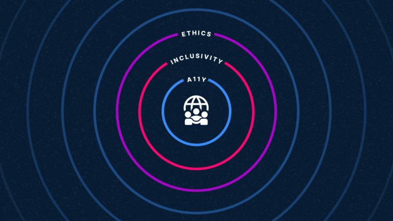
Web accessibility is a topic I’m passionate about—especially when considered as part of the web design process from start to finish (rather than as a consideration later on). I wanted to know more about the designer’s perspective on how and when accessibility becomes top-of-mind during the design process. Read on for some thoughts and resources from my fellow Thinkers.
Luke Pettway
Hello, designers! 👋🏼 I was just curious: what materials do you use when you are designing things and thinking about accessibility? How often does the thought come up about how a person with a disability might use your design?
JT Cobell
Hello, designer of code 👋. When you say materials, do you mean reference materials? Tools?
Luke Pettway
All the things! I’d love to know how it currently fits as a whole into each step of the process.
JT Cobell
Does Mikey count as a material/resource?
Josh Kubat
Yes.
Luke Pettway
At what point do you usually sit back and think, “hmmm, is this accessible”?
Josh Kubat
If we’re talking about tools, I use *Colour Contrast Analyser* to check all of my colors before they head into the next phase of work.
JT Cobell
I can only speak for my own process. I try not to break up when I’m thinking about usability and accessibility.
If it’s time to consider, is this flow/UI usable and intuitive? that’s when I’m pushing myself to think, is it usable by all users? Who are the people using this?
Are you interested in a particular type of accessibility? To Josh’s point, color contrast checks are built-in to (or available via plugins) most screen design software. But things like cognitive load, physical effort, and screen reader support are harder to test inside drawing software alone.
Josh Kubat
There definitely has to be thought and design effort put into these things, which is why I think someone like Mikey absolutely counts as a resource when a11y is concerned.
David Ridilla
“At what point do you usually sit back and think, ‘hmmm, is this accessible’?”
Through experience I try to make that part of my process, not a step in the process.
However, sometimes you do have to raise a red after the fact and do your diligence to find out if it’s okay.
Luke Pettway
Thanks @David Ridilla, this is actually really good. It shouldn’t be a step in the process at all, it is the process.
Luke Pettway
I’d make the argument that some of these things can actually be tested before you even have a design. Recently, I had the opportunity to audit a design over Zoom with one of the a WordPress design leads and we came up with this idea of “talking through a design.” It helps reveal issues like cognitive load. The rational being that if something is hard to explain it might also be hard to use.
Luke Pettway
I shared a doc in #accessibility that actually pertains to this conversation a bit. It covers how different “slices” of teams might interpret those standards and requirements differently.
Keren Toledano
For accessibility purposes, a heuristic analysis either BEFORE design or midway through, can be a great mandatory checklist for overarching usability concerns. I’m going to push my absolute FAVORITE heuristic list:
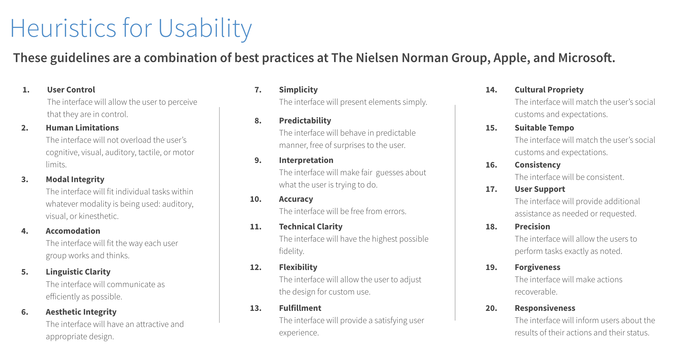
Susan Weinschenk and Dean Barker researched usability guidelines and rubrics from many sources like Nielsen’s famous 10, Connell & Hammond’s 30, Shneiderman’s Eight Golden rules, Apple’s Human Interface Guidelines, and Microsoft’s principles. They did a study to generate the conglomerate list of 20 above. It’s the most comprehensive and intuitive, imho
Luke Pettway
Are you familiar with POUR (Perceivable, Operable, Understandable, Robust)?
This looks like it covers a lot of the basis for that: Making Accessibility Accessible: The POUR Principles.
Keren Toledano
I don’t know POUR, but I trust Susan Weinschenk w/ everything, haha.
@Luke Pettway: Also, here’s a pretty wonderful resource for humanizing stories re: accessibility. Print it and have it on your desk: An Alphabet of Accessibility Issues.
Ken Mascaro
One thing I try to ask myself while designing is, “If I dropped all color and iconography, would the user still be able to successfully navigate the design and accomplish their goals?” It’s a small thing and doesn’t cover everything pertaining to accessibility, but it’s a step in the right direction.
Jack Valentine
I started reading my designs out loud. Does the nav make sense? Does a header describe what’s going on? Does a button tell me what it’ll really do?
Keren Toledano
Oh, sometimes printing the thing helps, too! Getting the designs out of the screen and into a different medium. Gives you a new perspective/clarity.
Luke Pettway
@Jack Valentine: Yes, that’s exactly the exercise we did and it really clicked for the designer I was talking to. That is essentially how a screen reader works.
Neha Agarwal
I often do a mental check against foundational design principles (color theory, gestalt theory, typographic best practices, space, composition, hierarchy scale, line, shape, texture, value, etc.). I find that classic design theories and principles are based in the way humans consume and create content, and thus there’s a lot of overlap between these theories and modern day accessibility standards. After that, I’ll use other tools and checklists to make sure I caught as much as possible.