Guerrilla UX: Exploring a Better Design for the SEPTAkey Kiosk

One of our favorite ways to quickly describe what Think Company does is that we “rid the world of frustrating experiences.” Every day we help our clients transform existing conditions into preferred ones.* We Thinkers are passionate about this cause, and we often chat about frustrating experiences in our daily lives that we wish we could fix.
My friend Dave Brindley, proud Philadelphia resident and founder of Not In Philly, shares my passion for good design and often texts me images and stories of bad design that he encounters in his daily life around the city. Recently he texted, “I just tried to get a SEPTAkey Card at one the new SEPTA fare kiosks—and boy, do they need some help from Think Company!”
The Problem
The SEPTAkey program is an awesome improvement to public transit in Philadelphia. Unfortunately, lots of people have reported frustration as they have tried to get a SEPTAkey card, refill their card, and perform other common tasks associated with the card. This problem exists not because of technical limitations or system malfunction, but because of poor user interface design. The new SEPTA fare kiosks and the new SeptaKey.org website should make it easy for people to get a SEPTAkey card and participate in the program—but today these systems deliver a frustrating customer experience.
We have the talent and expertise right here in Philadelphia to help SEPTA improve this problem. So Dave and I convened a small group of local UX designers, content strategists, and transit system experts to explore ways to improve one of the most important SEPTAkey customer experiences: the flow for purchasing and reloading the SEPTAkey card on the Septa fare kiosks.
Guerrilla UX
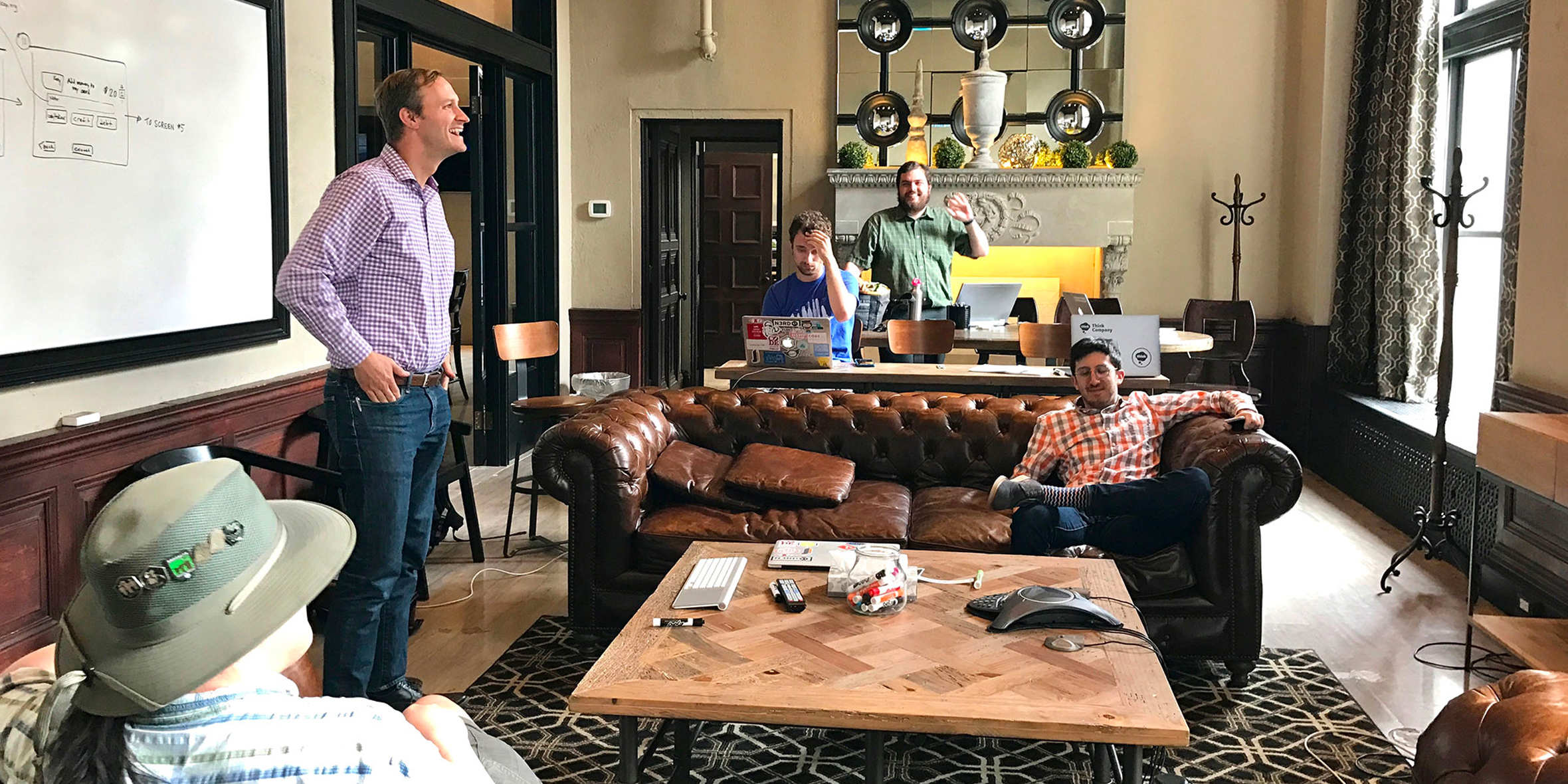
Like we always do at Think Company, Dave and I started with some field research. We used the kiosk to purchase a new SEPTAkey card and to reload an existing card and documented the current flow of the user interface. Then, folks from Think Company, Code For Philly, and 5th Square met together to discuss the problems with the existing flow and to whiteboard solutions for a better customer experience. You can read more about this team up via WHYY & Plan Philly.
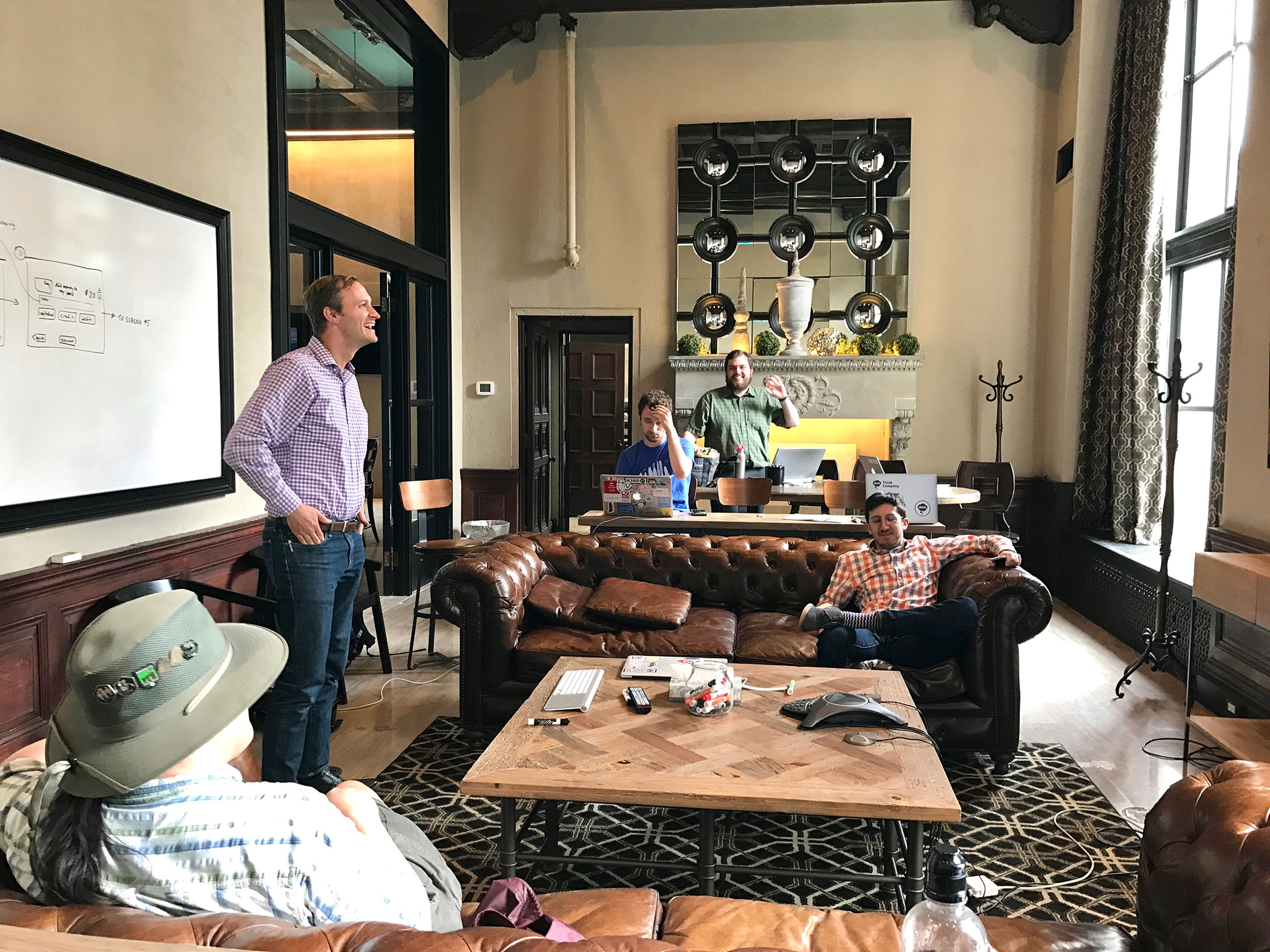
Of course, this was a very abbreviated design process! During our Think Session we made some guesses about previous design decisions and some assumptions about technical constraints—things we would have investigated further via meetings with SEPTA stakeholders if this were a full-scale project. Folks from SEPTA would have been active participants in the Think Session (we invited them!) and would have worked together with us to create the preliminary design concepts. We also would have shared the design concepts with a wide range of SEPTA stakeholders and with SEPTA customers to get feedback that would have guided several rounds of design iterations.
But even with a compressed design process, our fun little “guerrilla UX” project demonstrated what we set out to prove: design thinking (even just a few hours of it!) can dramatically improve the experience that people have with a product or service.
A Better Design
Our Think Session started with a discussion about the main things that a customer would most likely want to do at the kiosk, and we made sure these were presented clearly on the start screen.
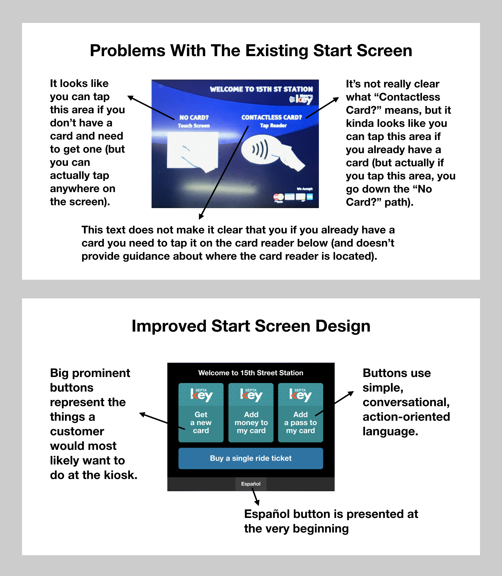
Then we discussed each of the three main SEPTAkey “use cases” (the three big SEPTAkey buttons) and sketched out a more intuitive flow that would help customers easily accomplish those tasks. Check out this PDF to see sketches and mockups of our improved flow and screen designs.
I hope SEPTA is already taking steps to improve the user interface design of the SEPTAkey system interfaces. If not, I hope the design ideas I’ve shared here (SEPTA, feel free to use them!) might help the SEPTAkey team improve the kiosk interface so that more Philadelphians can enjoy this great new program.
* This definition of design was coined by Herbert Simon in his book “Sciences of the Artificial.”