Forge Conference: On Making Digital Things
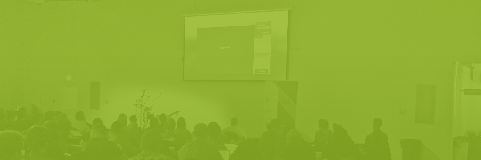
Last Friday, Mark Schuber and I attended the inaugural Forge Conference here in Philadelphia. Forge is described on the site as “a place for makers”, and the roster of speakers and attendees backed this up. Instead of recruiting speakers famous for…speaking…the organizers from O3 World opted to give a voice to practitioners working on the front line of digital innovation.
Obviously, makers dedicated to digital media would do well to study the techniques of their peers in more analogue pursuits, but we face some unique challenges given the ephemerality of our output. We need to find ways to cope with the challenge of working through abstract problems with very little precedent and communicating our solutions to an audience (both clients and end users) that’s much less familiar with the vocabulary we rely on than we are. The three speakers I focus on here offered some great advice that has helped me feel more comfortable with addressing both parts of that challenge.
Geoff Teehan (of Teehan+Lax fame) kicked off the day with this video of a drunk man “navigating” a fence. He described this mini opera as a metaphor for the design process. When we—as makers—are in the midst of struggling through a project, the simplest problems are often the hardest to solve. We need help along the way to provide us with a new line of sight that leads to a breakthrough. The source is rarely expected, but the outcome is often a revelation of the obvious.
To arrive at that point, Geoff argued we must attend to what matters. On one level, he used the example of his own talk: instead of focusing on the design of his deck (dark gray slides with white text), he spent his available time thinking about how to share some very personal lessons. More grandly, this approach requires eschewing convenient design trends to pursue the most elegant solution to the problem at hand. In other words, design for the long term and channel your energy into efforts that support an idea rather than showcase your talent.
Ian Collins, creative director at Simple, shared a principle that’s deeply embedded in the company: design is not a department. That ethos encourages everyone to put care into how they create and present their work, while feeling accountable for what they make. To support this principle, Ian’s team tries to provide tools that everyone at Simple needs to express their ideas without getting too hung up on “small” aesthetic decisions. He described in detail how they’ve built a centralized style guide and pattern library that lives on GitHub along with their process for maintaining and growing it organically. This artifact is about more than providing typography guidelines; it tells the story of how much consideration everyone has invested in Simple’s design. It keeps that story open and democratic and helps garner company-wide buy-in about new design decisions.
As part of Simple’s design story, Ian described how the foundation of Simple’s aesthetic shifted in response to iOS 7’s release. Designers are always looking for ways to do better design with less work. I’d never thought of it this way before, but “flat design” provides a way to do just that. Ian walked through an example of how much work is entailed in using a textured background as the plane on which every page element sits. Text needs a letterpress effect for legibility; images need frames to stand out; subtle gradients are required to give everything volume, and drop shadows abound. As a system scales up in size, the design work grows exponentially. By eliminating texture and embracing a solid background, more effort can be given to perfecting a typographic system (for instance) instead of embellishing it.
To take that one step further, Marc Anderson from Fantasy Interactive referenced Steven Hay’s quote, “we’re not designing pages, we’re designing systems…” to reinforce his message that “pretty isn’t good enough”. That’s an easy cause for us to get behind as pros in our field. But part of our job as designers is to bridge the gap between our intention to build a functional system and our client’s desire to see a beautiful visual representation of an idea.
This isn’t easy, but Marc gave us a quick glimpse at how FI introduces their clients to the systems they’re carefully and consciously crafting. First off, they reveal and explain the building blocks: colors, typography, a grid structure, etc. Second, they demonstrate how those components are used to create each element of the design and show the modular components in isolation, for example: header, sidebar, widget, content block. Third, they reveal how each of these components work together to create a cohesive experience when placed in proximity to each other. They communicate all of this through an elaborate but clear series of builds in a Keynote deck. Hey @marcbanderson, I’d love to see that example you showed again!
Thanks to Forge for giving us a place to talk shop and help us all find a few larger gaps in the gate that we’d previously ignored.