fivethirtyeight.com – Sometimes Gets It, Sometimes Doesn’t

It happens every two years. During a Senatorial or Presidential election cycle, I get a little obsessed and end up having to check in on the pulse of the nation regularly. Every time this happens, I find a few web sites that feed my need for political information. This time, it’s FiveThirtyEight.com. And it’s not just me; to be a blog launched in March 2008 and on Blogpulse’s top 10 linked-to blogs is quite an achievement.
FiveThirtyEight.com is run by Nate Silver, a baseball statistician best known for developing a system to forecast the performance of baseball players. The power of this site is not so much the blog entries, but the collection of charts and graphs displayed on the edges of the site. You see, Nate has a method for compiling all of the political polls into a model and predicting the elections if they were held today. This isn’t as simple as averaging a bunch of numbers. For instance, we learned in 2000 that the electoral college can be more important than the popular vote. We also know that some polling agencies are more or less reliable than others.
To account for all of this, Nate weighs each poll based on its past performance vs actual results. After that, it gets much more complicated. Those of you who are into predictive modeling may want to look here—just scroll down to “Process Overview” and keep reading.
Nate has a clear bias in his blog entries, but he goes to great lengths to keep the stats balanced. It’s clear when it comes to handling data and predictive analysis that Nate Gets It. But when it comes to visuals, sometimes Nate Gets It, sometimes he Doesn’t Get It.
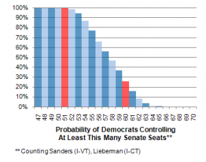
I routinely check four things on the site: the Electoral Vote pie chart, the Win Percentage pie chart, the Obama vs. McCain Projection Map, and his “Today’s Polls” posting. Sometimes I venture deeper and try to pretend some of the more complex stuff makes sense to me. For instance, I really want to know what everything in this chart means:
The primary message of this chart is clear: Democrats are going to dominate the Senate this year. Where I get confused is the zebra striping on the chart combined with the two red lines. On all of his other charts Red = Republican and Blue = Democrat, but I’m pretty sure that’s not what he intended here. The first red bar seems to say that’s where there is less than 100% chance, but why the other red bar at 25%? Wouldn’t it make more sense to highlight the part where the first likelihood is below 50%? Or maybe I just don’t understand the significance of the two red bars.
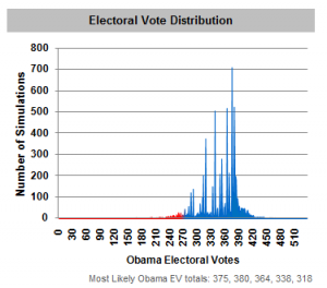
Then there’s this chart, which is so important that it sits right under the projection map:
All the words make sense, but I feel like I’m missing something. This chart is important to statisticians, but I feel like a child looking at it saying, “more blue simulations = happy dems… I guess.”
FiveThirtyEight’s charts are simple and get the point across, so this isn’t a classic case of what Tufte calls chartjunk. I may also not be the typical audience for the site. Clearly charts like this are important to the site, and I applaud Nate for displaying things visually. I’d love to buy him a copy of this. I think he’s too busy right now to read it.
What I would LOVE is a clickthrough for each chart with a short primer on what the chart is telling me, where the numbers come from, and what the significance is. Don’t change your charts, Nate—just let novice statistics geeks like me in on the hard stuff.


