Apple and Google Calendars: A Design Comparison

Apple and Google represent two very different approaches to design, and their competing calendar apps highlight the differences.
But before we dive into the comparison, a few spoiler alerts: this will not be an Apple vs. Google competition with a “winner” on the other end. Both design teams are excellent and have clear, logical reasons for the choices they make. Also, what follows will by no means be a fully comprehensive analysis of both applications. The differences are many and, as much as the design nerd in me would love to dive into detail about each one, I’ll spare you.
We’ll be examining the calendar apps both on tablet and mobile. For the tablet screens, I used an iPad Air running iOS 9.1 for Apple Calendar and a Nexus 9 running the Android Marshmallow (6.0) for Google Calendar. For mobile, the screens are on an iPhone 5 in both apps running iOS 9.1. I used the same phone on mobile to better accentuate the differences in how the screen real estate was used.
First, let’s consider the “month” view in both apps to get a bird’s eye perspective.
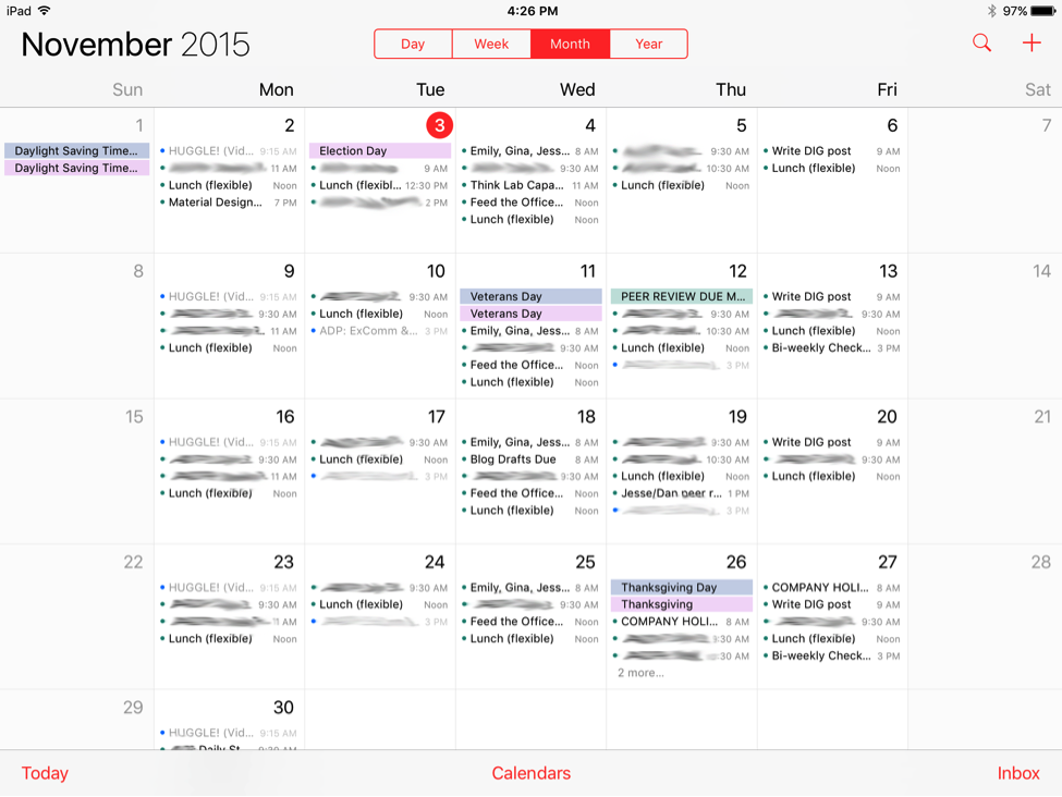
There are quite a few differences, but one of the most striking to me is the use of color.
Color
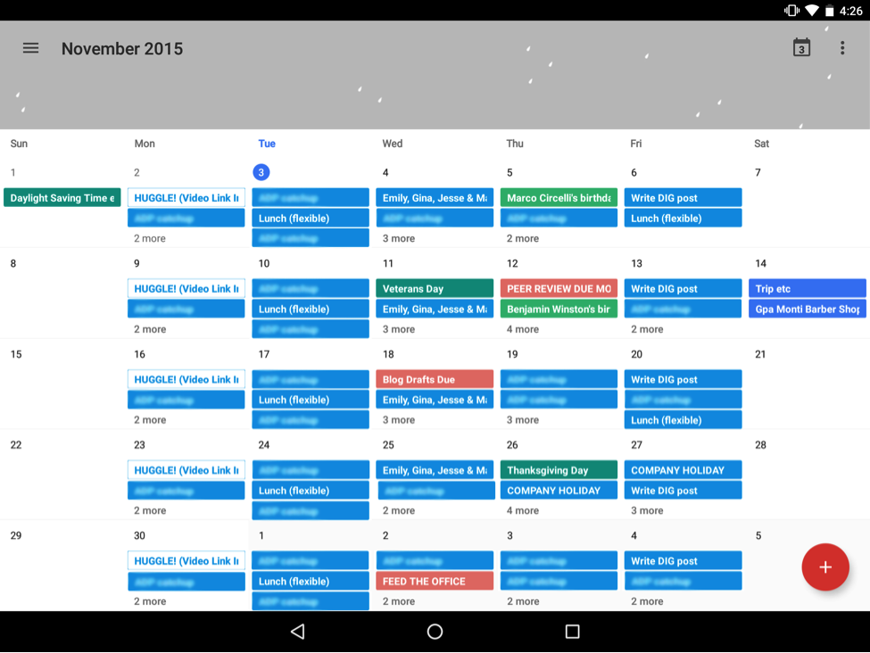
Google Calendar has a much bolder approach to color than Apple. Initially you might think that Google uses more color, but that’s actually not the case. It’s just that Apple’s use of color is more subtle, favoring varieties of grey and pastel.
The items in red are the one exception, drawing our attention to the current date (in this case, Nov. 3rd at the time of this screenshot) and the particular view of the calendar that is active (“Month” contained in the button group at the top). The solid background color on these two objects contrasts with the other colors, making it extremely easy to locate today’s date and find the controls to change the particular view.
Generally speaking, Apple Calendar reserves bright red for primary navigation and items that modify the calendar: the three items in the bottom bar, the button group at the top, search, and “+” in the top right.
Furthermore, the formerly red objects on the page become grey once a user clicks on an event. They are no longer red because those objects are not clickable anymore.
We might say Apple Calendar’s use of color is more geared towards utility—focusing on the elements relevant to taking an action with the app.
Google Calendar, by contrast, is full of larger and more saturated blocks of color, making many of the objects pop off of the page. Each event has a solid background color—there is an interesting illustration at the top (we’ll return to that later)—and the infamous red Floating Action Button (FAB) in the bottom right covering up the calendar event (ahem). A FAB is a common visual element in Google’s Material Design language meant to represent the primary action on a page. All of these elements make for a very colorful display.
One plus to this approach is that particular events I’ve chosen (as a user) to highlight with red clearly stand out from the rest. With the exception of all-day events, Apple Calendar, by contrast, doesn’t allow you to customize the color of an event—just a calendar (i.e. events from my personal calendar are all one color, and events from my work calendar are another). This rule, in combination with the fact that colors in Apple Calendar are only marked by a small dot, means that the majority of the events in Apple Calendar don’t stand out as clearly as they do in Google Calendar.
There are several disadvantages, however, to Google’s colorful approach. The colors don’t provide the same focus as Apple Calendar. With so many colors jumping off of the page, it can be difficult even to find which day is “today”. Also, the solid background colors force Google to use white text for event names, which is slightly more difficult to read than in Apple Calendar.
In addition to color, another striking difference is the use of illustration to accent certain events.
Illustration
To begin, let’s consider the mobile views for the same series of events—both in “schedule” view.
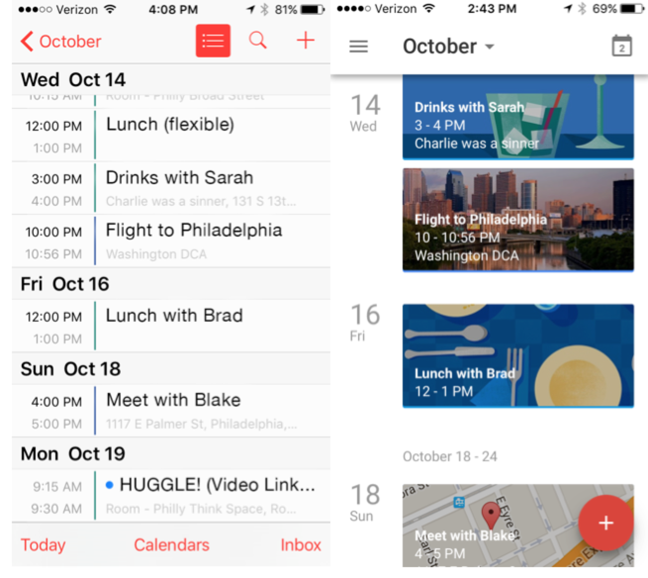
Apple Calendar generally sticks with a grey and red palette and simple text, using red for clickable elements as with the month view. No frills, very few icons, and no illustrations. Apple takes a minimalist design approach, removing as many visual distractions as possible to focus us on the text of the events.
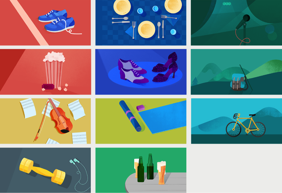
Google Calendar, in contrast, brings a whole host of illustrations to the calendar events, pulled in dynamically by Google Calendar based on keywords. For example “drinks with Sarah” has an illustration of a few cocktails, “lunch with Brad” has a table setting, “meet with Blake” has a Google Map preview and pulled an image of Philadelphia for my return fight. There are a set of other images that are designed for this purpose as well, each tailored to trigger on certain keywords.
These images bring a delightful personality to the Google Calendar view.
There are a few practical disadvantages to this, however. The text in Google Calendar events is more difficult to read over the images. The text “Meet with Blake”, for example, has a very low contrast ratio with the background image. In my day-to-day use of these apps, I found that the Apple Calendar view, while not as interesting, is much easier to scan.
Also, because of the background images, Google Calendar takes up a lot more space for each event. Granted, the Google Calendar example is somewhat extreme in that typically you won’t see four picture events back to back like this. However, I can only view four of these “picture events” in Google Calendar compared to six in the Apple Calendar.
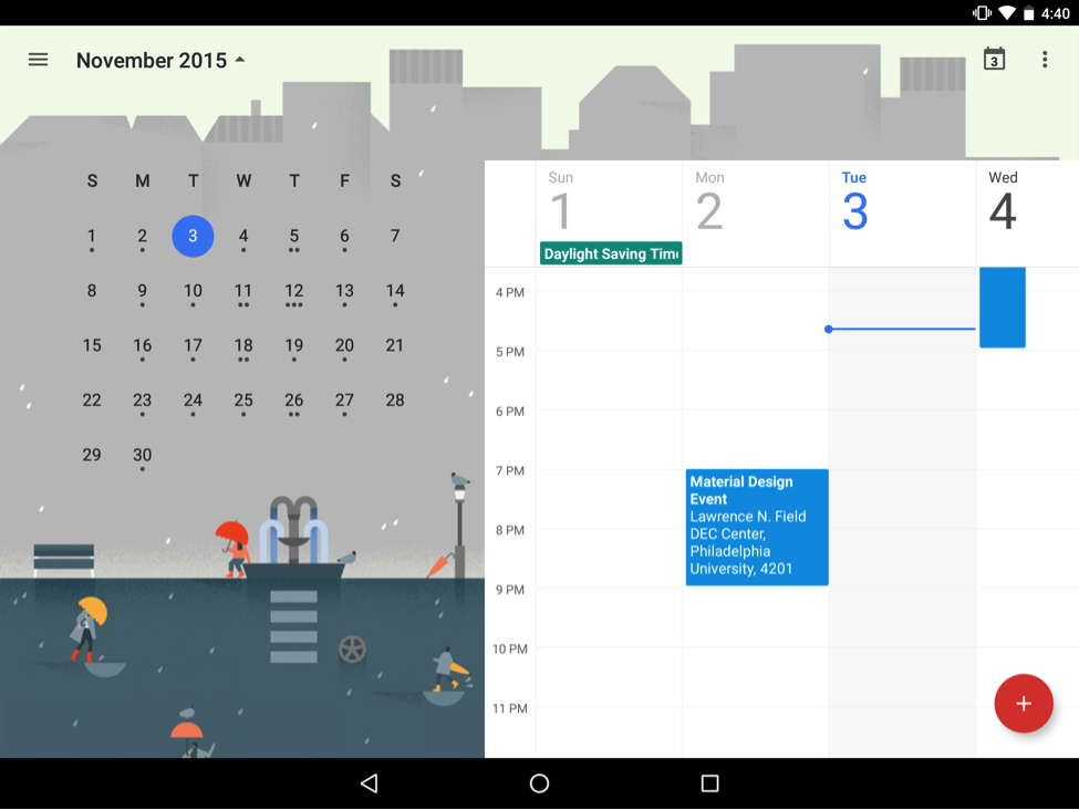
Speaking of illustration, let’s take a closer look at the illustration at the top of the month view in Google Calendar. This view is accessed by looking at the calendar in week, day, or schedule view and clicking the small arrow next to the month name.
In the background, there is a fun illustration of rainy November—a stylized city scene with a few people walking around with umbrellas. Each month has it’s own illustration that sits in the background.
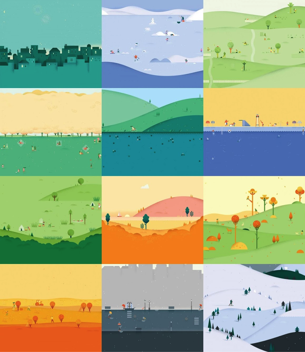
I confess, as a designer, I love this feature. The illustrations of the seasons add no utility or function except to be enjoyable.
However, I’ve learned time and time again that the things designers think are cool can often be met with annoyance or indifference by users who are just trying to complete a task. Just like the use of color and event illustration in Google Calendar, these season illustrations are a potential distraction.
Conclusion
Do you notice the trend? Apple’s design focuses on minimalism and utility whereas Google’s design focuses on personality and vibrancy. This is certainly reflective of Jony Ive’s remarks in the documentary Objectified that good design should be “inconspicuous” and feel “almost undesigned.” Although both platforms strive for simplicity, minimalism is consistently more of a theme in Apple’s design than Google’s.
Keep in mind that both are aesthetically well designed, and both are usable. The Apple Calendar doesn’t look bad, and Google Calendar isn’t overly difficult to use despite the extra visuals. But they both lean toward opposite ends of the spectrum.
Again, I’m just scratching the surface—time would fail us to talk about their approach to navigation, typography, differing functionality, or how they approach event creation. But these areas in the Calendar apps also reflect Apple and Google’s basic approach to design. They are both excellent and they are radically different.