A Website Walks Into A Bar…

I recently met with a project team to talk about content strategy for a website redesign, specifically about the tone and personality that we need to get across in the site. I described the desired state as: “If this website was at a cocktail party, we want it to be the most interesting person in the room without going to the extreme of having a lampshade on its head.”
This off-the-cuff description of the site’s personality made me start thinking about how to actually achieve that effect, and how it can be taken to an extreme.
Who is the most interesting person in the room at a cocktail party? Someone who…
- Invites conversation with both friends and new acquaintances
- Engages you in conversation while making you feel comfortable and important
- Tells great stories
- Draws you in and makes you want to get to know them more
- Has personality!
These are not just what gives people that je ne sais quoi in a social situation; these are all things that give a website personality too. A website that has these characteristics is one that stands out from the crowd, draws users in, and keeps them there.

Certainly, there can be some serious missteps in attempting to infuse a site with personality. Here are some cases of website personality gone bad (we originally toyed with including links here, but decided to let you identify your own – you’ll be able to spot them):
The “It’s Got a Great Personality” Website
This is the unfortunate case where the copy is saying all the right things, and the company has a great story to tell, but it’s masked by poor execution: inefficient site structure, visual design that doesn’t compliment the message, and/or confusing interactions. Common offenders: specialty manufacturing sites, benefits providers, and others with deep data repositories, lots of internal infrastructure reflected in the information architecture, and/or exhaustive customization options.
The “Lampshade On It’s Head” Website
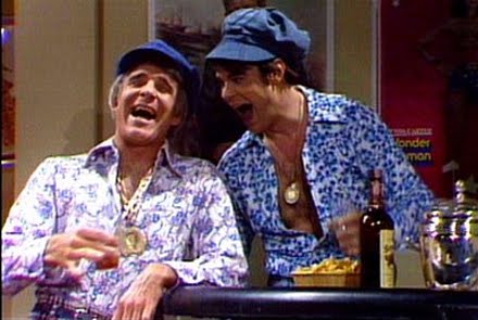
This is the wild and crazy guy website with the equivalent of finger guns that is just trying too hard. These sites want so badly for you to be their friend/customer that they appear overbearing and desperate. They may have sleek or even flashy design, and content that’s more marketing-speak and fluff than simple substance and utility. Common offenders: restaurants, slightly off-the-mark advertising campaigns, and start-ups trying a little to hard to break the industry conventions.
The “Wallflower” Website
This is the site that isn’t quite sure how to best let its true colors show, so it retreats in the corner nursing a lukewarm cup of punch – watching everyone else. They blend in among the noise of the web, coming across as generic and revealing their treasures to a small select few…perhaps coming across as cold and impersonal as a result. Common offenders: content aggregators, government sites, and non-profits that haven’t learned that a little personality doesn’t necessarily equal alienation – and that being milquetoast is often worse.
But of course, beauty (and personality) is in the eye of the beholder. It’s important to keep in mind that the characteristics of a website with great personality will mean different things to different industries and consequently, different user groups. The Lampshade website at a financial industry party may look like the Wallflower at a fashion industry party; it takes some smart market & user research to determine what kind of personality your own little monster should have to be most effective.
So let your customers know who you really are! Invite them to converse with you, make them feel important, and tell a great story. Cheers!


