The Tyranny Of Choice Strikes Again

I’ve experienced a few things recently that have reminded me of something I first read a few years ago: the idea of Tyranny of Choice. If you haven’t read the excellent article describing this phenomenon by Scientific American, do yourself a favor and download a copy of it here, courtesy of Swarthmore College.
The gist is that providing people with more choices is not necessarily a good thing, and in some situations can actually be debilitating. It makes sense, and maybe you’ve had a similar experience to me: I’m in no way an expert on investment funds, but when it comes time to figure out where to put my money, I’m faced with a daunting list of options—and I’m such a novice that I can hardly even make heads or tails of the differences between them aside from a few very broad categorizations.
What’s worse, once the decision is made, since it affects me on an ongoing basis I continually ask myself “did I make the right choice? Was/is there a better one? How will I know? What am I missing out on?” As a result, there are plenty of people who just disengage altogether because they can’t or don’t want to deal with the various stresses associated with it.
So how can we tame this beast?
1. Don’t Provide Choices That are Invalid and Prevent Users From Achieving Goals
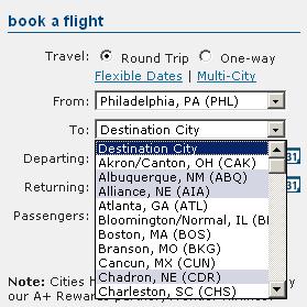
This resurfaced for me recently at An Event Apart, during a usability session where Robert Hoekman, Jr. was doing on-the-spot usability reviews and was looking at a website for an airline. Even though the airline only flies out of certain airports, in their “select a departure city” drop down list there are hundreds of major and minor ones—most of which they don’t even fly from.
Is this an out-of-the-box list or something? Why in the world would they do this? What’s more, the drop-down for destination city uses the same list, which isn’t truncated in any way after the departure selection is made. If selections are made that aren’t 100% compatible with available flights, the user feedback is simply “Sorry, there are no flights that match your criteria.” This means that even if you are lucky enough to select a valid departure city, if you select an invalid destination, you get the message above and no prescriptive feedback indicating where the problem lies. Ouch. Reminds me of the old Cheese Shop Sketch from Monty Python.
2. Don’t Provide More Choices Than Are Necessary in the Interest of “Showing Off”
Next was something I’ve experienced plenty of times over the years in different guises, a product company using valuable screen real estate to display numerous options and features that aren’t available (and therefore aren’t helpful) to users—an effort to show off the robustness of the product with all of the bells and whistles turned on. Instead of considering the tyranny of including choices that are smugly turned off, the thought was likely that a user would want to know why they couldn’t access those options and would try to find out how they could pay to turn them on. To me this is akin to visiting a car dealership and the salesperson trots you past every make and model on the lot regardless of your price range or other personal preferences and parameters. That doesn’t sound like a whole lot of fun, does it?
It’s OK to provide users with information about what other choices are available, but at best it should be when they ask for it, and at worst, it shouldn’t be a perpetual hard sell. Most people will want to get in and accomplish their goals quickly, intuitively, and with minimal distraction—not be constantly reminded of (and confused by) things outside of their workflow. Your advanced user will see what you’re up to, and your novice will be confused and frustrated. Make your core product a killer, and people will ask what else you can do for them on their own terms.
3. Don’t Make Users Responsible For Making a Choice Unless Absolutely Necessary
This one is a non-digital example of the mental strain that choices can create. Without getting melodramatic, our family dog very recently succumbed to a debilitating disease and had to be put to sleep. There’s enough emotional baggage inherent in that as it is—but as my wife and I tried to decide what to do, we came to the conclusion that we simply couldn’t make the decision while it was a choice. There would be too many “what if” questions. So, we resolved to do whatever we had to do (short of completely draining our bank account) if things were still at a stage where it was a “choice”.
Even when things were looking pretty dire, initial meetings with vets at a few locations had them saying things like “well, you could try acupuncture…or you could try putting the dog on wheels”… both of which would have done nothing for our dog in his particular condition, but were choices thrown out there (somewhat offhandedly, and I felt, irresponsibly, because of the pressure they placed on us) that confused us and made us wonder if we were doing the right thing. Those additional choices just didn’t seem consistent with what we knew of the disease and what we could see with our own eyes, but still we lost sleep over them.
Finally we met with a compassionate vet at Rau Animal Hospital who removed the tyranny of choice, explained the fallacy of the other proposed choices, and suggested to us that the most humane thing would be to let him go. While that was tough to hear, it felt like someone pulled a 10 ton weight off of us. The burden of choice had been removed, and we could make the decision to let our dog go without further loss of dignity or quality of life.
This is an extreme example with a heavy emotional component, but it proves a point—often times when you think you’re providing benefit by suggesting choices, it’s an easy enough thing for you to do but can have crippling effects on the novice users of your system. We’ve all interacted with clumsy systems that have way too many nodes of choice even when they could easily learn from individual user behaviors (ATM machines, anyone?), and some that even force you to make choices when there is only one realistic path (don’t get me started on the haphazard implementation of EZPass).
You don’t gain repeat business and loyal customers by increasing the amount of time someone spends interacting with your system. You gain it through minimal inputs being required to accurately achieve a desired result, minimal cognitive (and emotional!) processing, and keeping advanced features and functionality available for the nerds who want to look for them but out of the way of those who just want to get on with their day.


