Where For Art Thou, Whitespace?

Whitespace is one of those terms, much like The Fold, that has come far enough into the standard lexicon of most modern professionals that everybody knows just enough to be dangerous. Tell a client that their brand guidelines stipulate 30px of whitespace (or negative space) around their logo and they’ll more or less get your drift. Things start getting tricky however, when you start to hear that things are “too spread out” or the page doesn’t have enough “information density.” So here’s a quick recap on why whitespace is important and how you can best explain it.
Mark Boulton does a nice job of illustrating the highlights of whitespace usage in his post on A List Apart. It’s a few years old, but the concepts haven’t changed. He breaks it down into four main concepts:
- Macro and Micro Whitespace — the negative space between the major block-level elements of your page (macro) and the space between individual lines of text or specific inline elements (micro)
- Micro Whitespace and Legibility — the idea that how you manage your micro whitespace will directly impact the readability of your content. This can even come down to the weight of your typeface.
- Brand Messaging — how much whitespace you afford to your content will have a direct impact on how people percieve your brand. Boulton’s examples of direct mail vs. luxury brands is a good one. More examples to come, but the simple math is that less whitespace = less “class.”
- Active and Passive Usage — by default, most web browsers and applications cover the most basic of layout issues. These insure that your lines of text don’t run together and are at least legible. Defining more specific leading, kerning, or spacing across your whole document is what Boulton calls passive usage. Further defining unique whitespace settings to emphasize (or deemphasize) a specific passage would be active usage.
As with much of what we do in our profession, how you utilize your whitespace is going to have a lot to do with your goals and audience. Are you looking to encourage deep dives into complicated content or quick hits of high-level synopses? Is your audience “design-minded” or more interested in getting the best bang for their buck? How you answer these questions will help answer how you might best address whitespace within your design. Let’s look at a few examples from various industries that illustrate these principles.
Gmail
Google recently released an update to their Gmail interface that makes extensive use of whitespace to address readability on different screen sizes. The three options—“Comfortable,” “Cozy,” and “Compact”—are shorthand for “a lot”, “some”, and “minimal” whitespace. Notice how the more compact the layout becomes, the more overwhemling it becomes and the harder you have to work to parse out each separate message.
The Huffington Post
Ouch. Aside from the monstrous headline article above the fold (not in my screenshot, but trust me, it’s jammed up in there), there is little rest for your eyes on this one. Three jam-packed columns of text with some photos interspersed, presumably to draw attention, but they just get lost in the screaming cacophony of this site. Even when they do try to segregate content with those little pointy arrow labels, it’s just more noise. I’m not sure what their goal was when laying this out, but if it was to discourage actual reading and retention, they succeeded. Definitely a case of more is less.
The Verge
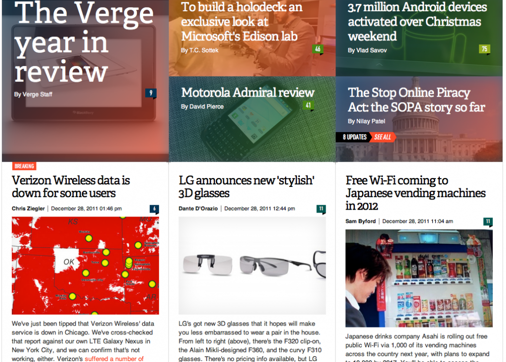
Contrast this site with HuffPo. Both use the same 3-column format and both are trying to jam a lot of stories on the front page. Where The Verge succeeds, though (assuming readability is their goal), is in using color and typeface — but also whitespace — to separate their stories and set them apart from each other. All those serifs down the left-hand side of Huffington add up. The Verge also does a better job of letting their columns breathe with about twice the gutter space between them.
Aesthetics aside, there is also the question of quantifying readability and comprehension. A 2004 study from the Software Usability Research Laboratory at Wichita State University focused on the impact of whitespace on both comprehension and satisfaction. A fairly straightforward experiment, they presented participants with a standard piece of text formatted both with and without margins as well as with and without adjusted leading (the space between lines in a paragraph). They found that while reading speed dropped for the with-margin example, comprehension (and satisfaction) was higher. Additionally, while leading had no impact on speed or comprehension, participants noted that they preferred reading the samples with adjusted leading.
By now, I’m hoping you have at least a working knowledge of what whitespace is, how it can manifest itself in your designs, and some ways in which it can impact how users interact with and internalize your content. There aren’t many hard and fast rules about what works and what doesn’t (you may have noticed that study didn’t tell us the optimal margin or leading). This is the point where you, the Designer, have to step up and defend your work. If you hadn’t considered whitespace before, go back and see how you’ve used it in the past. It may be that you subconsciously accounted for all these issues just by trying to make your work “look good.” If not, take the opportunity to learn from your mistakes and prep for the next project where you can make effective use of the spaces between your content. You may find that what’s not on the page is just as important as what is.


