Design Inspiration Everywhere: Spike Jonze’s “Her”

The film Her by director Spike Jonze is a stimulating and immersive visual experience; I would recommend it to all fellow designers. It’s captivating just on the surface, thanks to the beautiful cinematography and smart pacing—but there are carefully considered elements existing a little deeper that really make this film unique and provide some analogues that could be helpful for designers attacking a challenge.
Envisioning a Probable Future
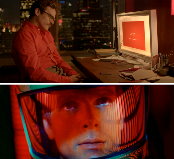
Many times films set in the future seem a bit disconnected from the present. That can be by design, but it can become a distraction also—in particular, the technology depicted can have the audience sidetracked with questions like “Wait, how did we manage to figure that out?” or “Is that even possible?”
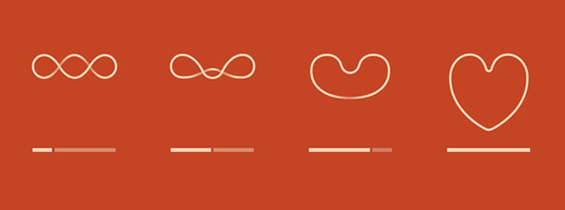
“Her” is a different experience though, where the future depicted was obviously very carefully thought out—what we see is certainly technology beyond our current abilities, but it follows a curve that it already feels like we’re traveling. Whether it’s the constant reliance on a smart phone (albeit it in a less intrusive way), the retro-mod clothing, the loading progress bar of the IOS in question…it all seems like what we could likely be experiencing in the coming years.
Driving Emotional Connections Using Technology, Despite Technology
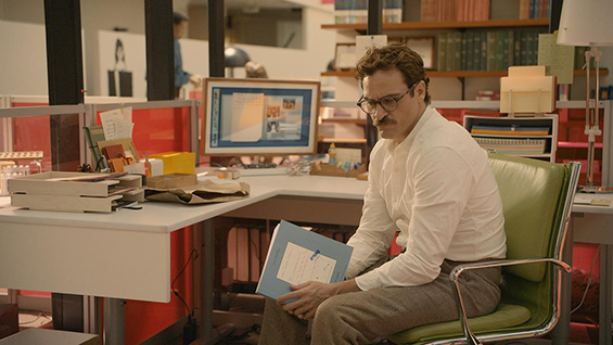
The main character’s career consists of being paid by individuals to write beautiful, heartfelt and very personal letters to their significant others, family members, etc. He dictates the sentiments aloud as they are captured and displayed in real time as hand-written letters that can then be printed in a way that makes them look and feel fully authentic.
It’s an archaic practice to write a hand-written letter even today, but in an envisioned future where technology is even more ubiquitous and the nature of making connections with each other, even those closest to us, has continued to evolve into a place of emotional isolation, I was struck by the finesse and charm of the output. Maybe it wasn’t fully “authentic”, but the ends generated by the means made me wonder if that was such a bad thing—and don’t we see some parallels even today in the form of e-cards?
Wrapping The Alien In The Familiar
The plush color scheme and approach to fashion echoes something you might find in a pleasantly worn and faded Sears catalog you’d find in your aunt’s basement, but somehow transcends any certain era and seems new again…drawing us in closer. It’s futuristic, but also comfortable (these things aren’t by accident, either) and stems from familiar cultural touchstones. It’s an interesting way to approach the purely aesthetic side of design—what are other ways we can ease our users’ transitions into new interfaces and workflows by providing subtle clues that they’ve “been there before”?
For designers, the ultimate takeaway may be that as we ask users to come with us on a journey—one of storytelling or one of adopting the next generation of an interface—the smoothest transitions, and the ones that people will be comfortable immersing themselves in, are the ones that have reference points in the present (and/or past). In essence, it’s understanding which conventions are truly standards based on who we are (and will always be) as human beings, and those which are more superfluous and can change or be updated without breaking “suspension of disbelief”, to use a movie term.


Send us a postcard, drop us a line
Interested in working with us?
We scope projects and build teams to meet your organization's unique design and development needs. Tell us about your project today to start the conversation.