Digital Design At The Doctor’s Office
Name.
Address.
Insurance information.
Family medical history.
Previous surgeries.
Current pain on a scale from 1-10.
The last time I went to the doctor’s office, another patient and I privately cursed the need to complete five different forms with twelve cumbersome pages of personal and medical information—the same info we’ve all completed hundreds of times before.
“What do they do with it? Throw it away? What a waste of time,” my fellow impatient waiting room sufferer complained. “Why can’t they just send me an online form before my appointment and save it?”
“It’s not that hard. The technology exists.” I stated, “It’s just a web form and database.”
“Yeah, and if someone didn’t have a computer at home, they could use an iPad to fill out the form in the office,” he suggested.
From my experience with other Think Brownstone projects, I know that there’s a HIPAA component, security and compliance concerns, etc., so nothing regarding healthcare data collection/security/sharing is that simple—but in the waiting room, I represented the layperson and the typical patient (we are all patients), and the common perception.
Lo and behold, twenty hours before my doctor’s appointment on Wednesday, I actually did receive an email with the subject: “We Would Like To Remind You About Questionnaires For An Upcoming Appointment.” Unfortunately the subject didn’t prompt me to open the email because I assumed it was a post-visit satisfaction survey. Perhaps a retitle to something like “SAVE TIME: Complete This Form before Your Appointment” (and then testing results via analytics?).
When I arrived at the office, a touch screen was centered in the middle of the reception desk with instructions “Type your name and have a seat.” After a couple of tries poking at the touch-screen, it registered my last name and I hit “New Patient” at the bottom of the screen.
When I was called to the reception desk, I was handed an iPad and scolded, “You didn’t complete the online questionnaire. Here. There are four sections you have to complete. Don’t hit this button (the button on the bottom of the pad) or it will shut off. Bring it back to me when you’re done.”
The interface was straightforward. First, I had an option to Start or choose Large Buttons. Not confident in what that meant, I hit Start.
Questions flew around in a merry-go-round fashion with large color coded rectangles to mark my answers. Upon completing the first carousel the next merry-go-question flew in from the right. Fancy.
After finishing the question about prior surgeries and I tapped “Cardiac” by accident, then Next. I couldn’t figure out how to go back to correct my answer since there was no Back button. Finally, I figured out the little green buttons on the bottom of the screen would allow me to navigate between the question carousels.
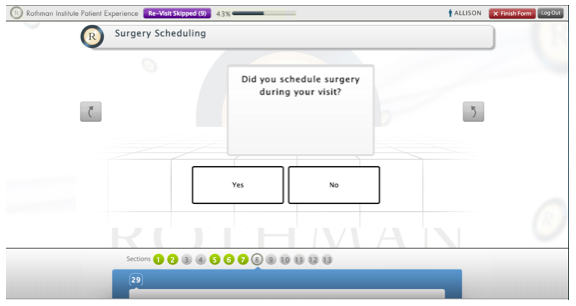
When I returned the iPad, I learned “You’re still not done. You didn’t fill out all the questions. Come back when you’re done.” User error—I missed the “Skipped ” warning on the screen. Clearly, despite my day job I am one of the impatient masses we regularly profile during research that do NOT read everything on the screen! How about the message that my questionnaire was incomplete being the front-and-center leading message? After reading the confirmation that I’d reached the end of the questionnaire, my brain shut off.
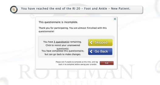
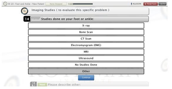
I was instructed to tap “Skipped” and saw all of the questions without an answer for “None of the above.” I told her, “Since I didn’t see ‘None’ as an option, I didn’t select anything and skipped to the next question.“ Design failure this time: she said I had to select “Other” since there wasn’t a “None” answer. More Frustrating, I had to then enter “None” in the subsequent text box. Sigh.
Some quick reinforcement of digital design rules of thumb based on this experience:
- No matter the industry or the target audience, one thing we see consistently is that people don’t want to do things that feel like “work.” So, whatever it takes, figure out how to eliminate repetitive tasks and hang onto valuable data when it is supplied. Even better, if anything can be pre-populated or somehow gathered automatically (for validation by the user, of course), go that route first.
- Avoid overly formal or flowery language that can potential obscure what it is you want users to do. GET TO THE POINT, as clearly and succinctly as possible—especially in email subject lines—or folks will miss it.
- Be consistent about the use of buttons/checkboxes/etc. and the kinds of responses they elicit from the system. The checkbox on top of a button syndrome, for instance, breaks convention and makes my brain hurt. Also, give priority placement and focus on the things you want users to do and/or are what they are likely to do 80% of the time (i.e. “Start” vs. “Large Buttons” or “Help Guide”).
- In a situation where mistakes can cause critical issues/misunderstandings/stress, make the navigation as simple, clear, and consistent as possible to move forward and back and make edits.
- Don’t bury critical error messages that will break subsequent workflows (within the digital system or outside of it—i.e. the receptionist handing the iPad back and saying “no, you’re not finished”). Try to eliminate show stopping errors contextually whenever possible so users don’t end up with a laundry list of “here’s everything you did wrong over the last 10 clicks. Go back and fix it. But if there are some messages that can only be delivered cumulatively, make them the star of the show—and if necessary, don’t give users other potentially paths to take if what they really need to do is fix the error first. If I still had errors to fix, then no, I hadn’t “reached the end” as the confirmation message said.
All told, I’d give the electronic questionnaire a B+ and give the office a big A for effort. At least they’re taking tangible steps toward improving their patient experience (and hopefully their data records as a result). It’s a start, but I still wonder if they’ll will send me the same email 20 hours before my next appointment or hand me another iPad once I arrive with the same darn questions to complete yet again. I’ll let you know…
Send us a postcard, drop us a line
Interested in working with us?
We scope projects and build teams to meet your organization's unique design and development needs. Tell us about your project today to start the conversation.


